
Remember when a band’s image mattered just as much as their sound? In the 1990s, alternative rock didn’t just change what we heard; it completely rewired how we saw. Before the internet took over, your connection to music was physical. You held the CD case, you taped the flyer to your dorm wall, and you watched the video on MTV until it wore out. This era built a visual language that felt raw, unpolished, and deeply human-a direct rebellion against the glossy, airbrushed perfection of the 1980s.
The look wasn’t an accident. It was a calculated mix of punk ethics, early digital experimentation, and a desperate need to express angst in a way that looked as messy as it felt. From the photocopied flyers of Seattle’s underground clubs to the surreal album covers of Radiohead, this visual identity created a bridge between subculture and mainstream pop culture. Here is how posters, videos, and art defined the decade.
The Rise of the Gig Poster
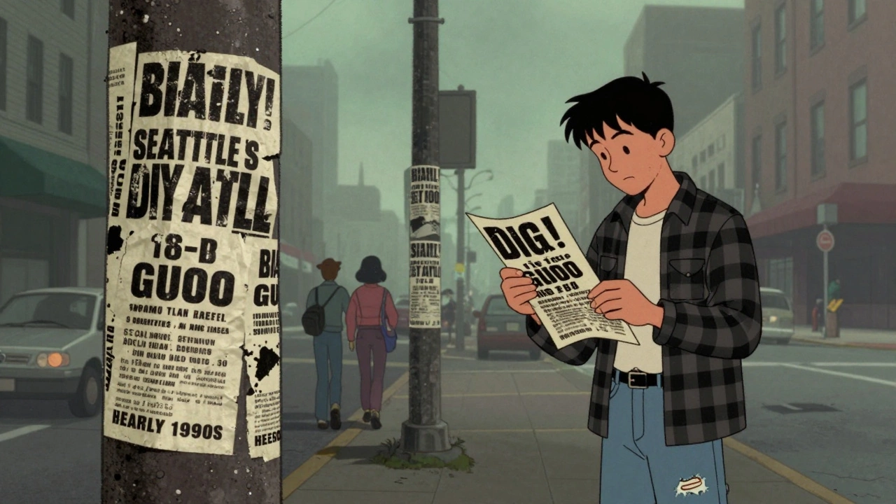
In the early 90s, if you wanted to see a show, you didn’t check Facebook. You walked past telephone poles in Seattle or Olympia, looking for those crumpled, black-and-white flyers. These weren’t professional advertisements; they were artifacts of the scene. Labels like Sub Pop Records, founded by Bruce Pavitt and Jonathan Poneman, relied on a DIY aesthetic that screamed authenticity. The flyers were often cut-and-paste collages, featuring hand-lettering and grainy photography that looked like they’d been run through a copier five times too many.
This lo-fi style had roots in the punk movement of the late 70s and 80s, but it evolved quickly. As bands like Nirvana and Pearl Jam broke into the mainstream, the posters got bigger and more colorful, yet they kept their rough edges. Artists like Frank Kozik and Derek Hess became household names in rock circles. Kozik, working out of Austin and San Francisco, famously appropriated 1950s advertising and WWII propaganda imagery, recoloring them in neon palettes to create a satirical clash between mid-century optimism and grunge despair. His work for Nirvana and the Melvins isn’t just memorabilia; it’s social commentary printed on heavy stock.
| Element | Description | Purpose |
|---|---|---|
| Screenprinting | Hand-pulled silkscreen with limited color palettes (3-8 colors) | Retained texture and "human" imperfection; contrasted with mass-produced offset prints |
| Distressed Typography | Fonts that looked worn, stamped, or hand-drawn | Evoque urgency and underground credibility |
| Found Imagery | Collaged elements from old magazines, medical texts, or comics | Created surreal juxtapositions and challenged consumerist norms |
| High Contrast | Black ink on white paper or bold spot colors | Made images pop from a distance on crowded street poles |
The technology behind these posters was a hybrid of analog and early digital tools. Designers used Adobe Photoshop 2.0-4.0 and Illustrator to separate colors, then burned films onto screens with mesh counts ranging from 160 to 230 threads per inch. This process allowed for complex layers and halftones, creating the dense, psychedelic look seen in posters for Soundgarden and the Smashing Pumpkins. Today, original screenprinted posters from this era are highly collectible, often selling for hundreds of dollars at auctions, proving that this "throwaway" art form has lasting value.
Album Art That Rejected Glamour
If the poster was the invitation, the album cover was the statement. By the early 90s, CDs had surpassed cassettes as the dominant format, giving designers a square canvas that demanded attention. But alternative rock artists refused to play by the rules of 80s metal or pop. There were no dragons, no scantily clad models, and no laser grids. Instead, there was ambiguity, discomfort, and stark realism.
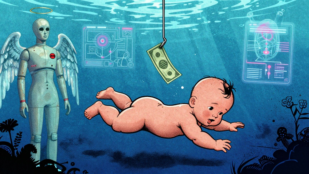
Nirvana’s Nevermind remains the gold standard for this shift. The iconic image of a naked baby swimming underwater toward a dollar bill on a fishhook wasn’t just random. Art director Robert Fisher and Kurt Cobain chose it to symbolize innocence corrupted by commercialism. It was unsettling, memorable, and perfectly captured the tension of a punk band suddenly facing global fame. Similarly, In Utero featured a medical mannequin with angel wings, blending anatomy textbooks with religious iconography to reflect vulnerability and pain.
Across the Atlantic, Britpop developed its own distinct visual language. Bands like Oasis and Blur worked closely with designers to create covers that rewarded close inspection. Brian Cannon, who designed Oasis’s Definitely Maybe and (What’s the Story) Morning Glory?, filled his covers with symbolic objects and domestic interiors. He wanted fans to spend time decoding the images, embedding references to British culture and the band’s influences. Meanwhile, Blur’s Parklife used bright, flat colors and a photo of a racing greyhound to signal a kitsch, everyday British life that stood in sharp contrast to the darker American grunge aesthetic.
Radiohead offered another strand entirely. For The Bends and OK Computer, Thom Yorke and artist Stanley Donwood (known as The White Chocolate Farm) created artwork that reflected technological alienation. They combined screenprinting with photocopy distressing and glitchy drawings. The result was a visual representation of information overload-ghostly diagrams and corporate-speak phrases that mirrored the lyrics’ themes of disconnection. This approach influenced a generation of designers who saw graphic design not just as decoration, but as an extension of the music’s emotional core.
MTV and the Video Revolution
You can’t talk about 90s alternative visuals without mentioning MTV. The channel was the gatekeeper, and its programming shaped how millions of people experienced music. Shows like 120 Minutes provided a platform for alternative videos that couldn’t get airtime on prime-time slots. These videos established a visual canon that prioritized mood over narrative.
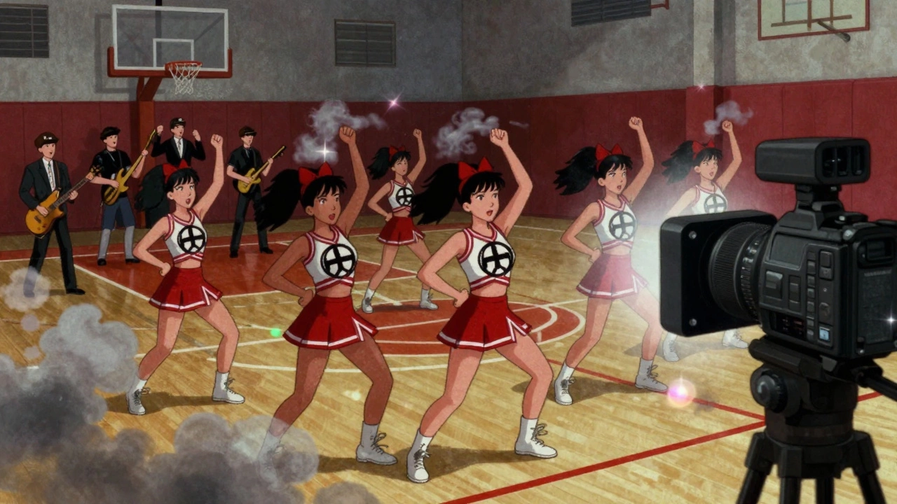
Nirvana’s "Smells Like Teen Spirit," directed by Samuel Bayer, set the template. Shot on 16mm film with smoky lighting and muted colors, it featured a cheerleader squad wearing anarchy symbols and a gymnasium descending into chaos. It wasn’t a polished performance clip; it was a depiction of teenage boredom and explosive rebellion. Bayer’s use of rapid editing and frenetic camera work matched the song’s dynamics, influencing dozens of subsequent grunge videos.
Directors like Kevin Kerslake and Spike Jonze pushed these boundaries further. Kerslake used over-cranked slow motion and lens flares in videos for Nirvana and the Smashing Pumpkins, creating a hazy, dreamlike quality. Jonze, coming from skate and indie-film culture, brought humor and nostalgia. His video for Weezer’s "Buddy Holly" composited the band into the 1970s TV show Happy Days, while his work for the Beastie Boys parodied 70s cop shows. These videos proved that alternative rock could be playful, ironic, and visually inventive.
On the darker side, directors like Mark Romanek and Michel Gondry explored experimental techniques. Romanek’s video for Nine Inch Nails’ "Closer" used 1920s science-lab imagery and religious iconography, pushing the limits of what MTV would broadcast. Censorship constraints actually shaped the creative process, forcing directors to imply rather than show, which often made the imagery more powerful. By the mid-90s, non-linear digital editing systems like Avid Media Composer and Adobe After Effects became standard, allowing for more complex compositing and color grading that aligned with the increasingly layered sound of bands like Radiohead.
The DIY Ethos and Subcultural Identity
Underlying all these visuals was a strong ideological stance. Alternative rock positioned itself as oppositional to the corporate stadium-rock and glam-metal of the previous decade. The rough typography, thrift-store fashion, and deliberately "ugly" visuals were an aesthetic manifestation of economic recession and disillusionment with consumerism. Writers like Simon Reynolds have noted that this look inherited its ethics from punk, valuing authenticity over polish.
This ethos was particularly visible in the Riot Grrrl movement. Centered in Olympia and Washington, D.C., bands like Bikini Kill and Bratmobile produced zines and posters using cut-up magazines and handwritten manifestos. Their visuals used domestic imagery and childhood photos to critique media representations of women. Album art like Hole’s Live Through This, featuring a crying beauty queen, invoked and disturbed mainstream images of femininity. This strand of alternative visual identity highlighted issues of gender and body politics, using similar photocopy and collage aesthetics to make a political statement.
Even as alternative rock went mainstream, it retained this veneer of amateurism. Bands like Pearl Jam commissioned unique poster art for nearly every show, generating hundreds of distinct designs. This practice created an active collector market and reinforced the idea that each show was a unique event, not just another stop on a corporate tour. The visual identity of the 90s was a balance between underground sensibilities and major-label budgets, a tension that gave the era its distinctive energy.
Legacy and Modern Revival
Today, the visual identity of 1990s alternative rock continues to influence design, fashion, and music marketing. Museum exhibitions like Nirvana: Taking Punk to the Masses at MoPOP have canonized gig posters and album art as significant cultural artifacts. Fashion brands regularly revive 90s band T-shirts and graphic motifs, from luxury houses to streetwear labels. The smiley face logo of Nirvana or the baroque imagery of the Smashing Pumpkins remain instantly recognizable symbols of youth culture.
For contemporary designers, recreating this look involves understanding both the analog and digital techniques of the era. It means working with limited color palettes, high-contrast textures, and screenprinting or risograph printing rather than full-color CMYK. It’s about embracing imperfection. In a world of high-definition digital clarity, the grainy, collage-heavy aesthetic of the 90s offers a refreshing sense of humanity. It reminds us that art doesn’t have to be perfect to be powerful-it just has to be real.
Who were the most influential graphic designers in 1990s alternative rock?
Key figures include Frank Kozik, known for his satirical appropriation of vintage ads; Derek Hess, famous for his expressive line drawings; Justin Hampton, who bridged the gap between DIY flyers and professional screenprints; and Stanley Donwood, who collaborated with Radiohead to create surreal, dystopian album art. Brian Cannon also played a crucial role in defining the Britpop aesthetic for Oasis.
Why did 1990s album covers look so different from 1980s ones?
The shift was a deliberate rejection of the glossy, airbrushed glamour of 80s hair metal and pop. Alternative rock embraced a DIY, anti-corporate ethos that valued rawness and authenticity. Designers used lo-fi techniques like photocopying, collage, and distressed typography to reflect the music's emotional intensity and the cultural disillusionment of the post-Reagan era.
How did MTV shape the visual identity of alternative rock?
MTV was the primary distribution channel for music videos, making them essential for band visibility. Directors like Samuel Bayer and Spike Jonze established a visual language characterized by moody lighting, handheld camera work, and non-narrative storytelling. This helped define the "grunge" look and spread alternative aesthetics globally, influencing fashion and graphic design beyond the music industry.
What role did gig posters play in the 1990s music scene?
Before social media, gig posters were the main way to advertise live shows. They served as both functional advertising and collectible art. Artists like Frank Kozik and Ames Bros created limited-edition screenprinted posters that captured the spirit of the bands and the venues. These posters are now highly valued by collectors and are considered important examples of modern graphic design.
Is the 1990s alternative aesthetic still relevant today?
Yes, its influence persists in contemporary design, fashion, and music marketing. The DIY ethos, use of collage, and embrace of imperfection resonate in a digital age that often feels overly polished. Vintage band merchandise and reissues of classic album art continue to sell well, and modern designers frequently reference 90s styles to evoke nostalgia and authenticity.