
Think about the last time you clicked on a song. You probably didn't hear the music first. You saw an image. A face, a landscape, or a bold graphic. That split-second decision to listen is driven by album cover photography, which serves as the visual handshake between an artist and their audience. It’s not just decoration. It’s a strategic tool that defines who the artist is before a single note plays.
Back in the day, records came in plain brown paper sleeves. There was no story, no style-just the music inside. Today, whether it’s a vinyl record spinning on your turntable or a tiny square thumbnail on Spotify, that image carries the weight of the entire brand. This article breaks down how professional photographers and art directors collaborate to create these iconic visuals, why they matter more than ever in the digital age, and what makes a great album cover stand out from the noise.
From Brown Paper to Visual Storytelling
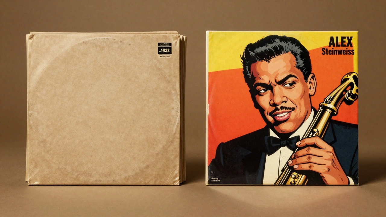
Before 1938, if you bought a record, you got a generic sleeve with a small sticker telling you what was on it. Zero visual appeal. That changed when Alex Steinweiss was hired by Columbia Records as an art director. He introduced illustrated and photo-based covers, and sales jumped significantly. For the first time, the packaging became part of the product. People weren’t just buying music; they were buying an object they wanted to display.
The real game-changer arrived in 1948 with the introduction of the 33⅓ rpm long-playing (LP) vinyl record. The canvas expanded to a full 12-inch square. Suddenly, artists had room to breathe. Labels like Blue Note, Impulse!, and Verve began commissioning specialized photographers to capture the essence of jazz musicians. Charles Stewart shot over 2,000 covers for labels like Prestige and Savoy, creating a visual archive of legends like Louis Armstrong and Miles Davis. By the mid-1950s, designer Jim Flora noted that "everything went photographic." The photograph wasn’t just supporting the text anymore; it was carrying the entire message.
| Era | Dominant Format | Visual Strategy |
|---|---|---|
| Pre-1938 | Shellac Records | Plain sleeves, catalog stickers only |
| 1938-1948 | 78 RPM Records | Illustrations, early photos, limited space |
| 1948-1980s | LP Vinyl / Cassette | Large-format photography, conceptual art, gatefolds |
| 1980s-2010 | CD | Smaller format, minimalist design, jewel cases |
| 2010-Present | Streaming / Digital | Square thumbnails, high contrast, mobile-first composition |
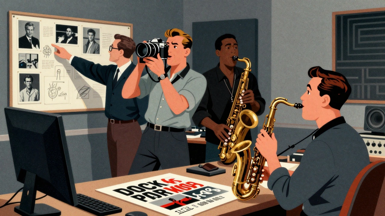
The Creative Triangle: Photographer, Director, Artist
A great album cover doesn’t happen by accident. It’s the result of a tight collaboration between three key players: the musician, the photographer, and the art director. Each brings a different perspective to the table.
The photographer provides the raw visual material. In the jazz world of the 1950s and 60s, figures like Francis Wolff at Blue Note Studios acted as both producer and photographer. His candid, black-and-white shots taken during recording sessions defined the look of hundreds of albums. He captured the intimacy and seriousness of the music in a single frame. In rock, photographers like Annie Leibovitz or Jerry Schatzberg brought a cinematic quality. Schatzberg’s slightly blurred portrait of Bob Dylan for *Blonde on Blonde* perfectly matched the enigmatic, layered nature of the songs.
The art director acts as the bridge between the music and the market. They choose the photographer, approve concepts, and ensure the image aligns with the label’s branding strategy. Think of Alex Steinweiss in the late 30s or Storm Thorgerson of Hipgnosis in the 70s. Thorgerson worked with Pink Floyd and Led Zeppelin, often using surreal, staged photography that forced fans to look closer. He didn’t just take pictures; he created puzzles.
Finally, the graphic designer integrates the photo with typography and layout. In the mid-century jazz era, this meant minimal sans-serif text and duotone printing. In the 70s rock scene, it could mean layering multiple negatives with hand-lettered titles. Today, designers must also consider how the image will look when shrunk down to a few pixels on a smartphone screen.
Artistic Direction: Matching Image to Sound
How do you translate sound into sight? That’s the job of artistic direction. Different genres demand different visual languages. Jazz albums from the 50s and 60s often used close-up portraits with dramatic lighting against dark backgrounds. This suggested intimacy, seriousness, and technical mastery. Rock and pop in the same era leaned toward playful, surreal, or street-level imagery. The Beatles’ *Sgt. Pepper’s* or Pink Floyd’s *Wish You Were Here* used photography as part of a larger conceptual statement.
In the 1980s, minimalism took over. Artists like Madonna, Prince, and Michael Jackson used simple, high-contrast portraits with clean negative space. The goal was brand recognition. You should be able to identify the artist from a distance. This approach works because it cuts through the clutter. When Amaya Segura, a senior art director at Sony, talks about modern covers, she emphasizes clarity. With mobile screens being so small, you need bold color blocking and simplified text. If the viewer has to squint to see who is on the cover, you’ve lost them.
Contemporary artists still use staging and symbolism. Billie Eilish’s early work used neon greens and oversized clothing to project a specific mood. Kanye West and Beyoncé have used high-fashion photography to elevate their status beyond musicians to cultural icons. The image tells you not just what the music sounds like, but how important it is.
Photography vs. Illustration and Digital Art
While photography dominates, it hasn’t always been the king. From 1938 to the mid-1950s, illustration was the primary medium. But as rock and roll exploded, photography offered something illustrations couldn’t: authenticity. Fans wanted to see the real person behind the voice. Rebellious poses, unconventional fashion, and street scenes sold records to a youth market that valued realism.
However, the lines have blurred. In the 1970s, groups like Hipgnosis used heavy post-production, multiple exposures, and collage to mix photography with illustration. Today, tools like Photoshop allow for hybrid visuals. Grunge, hip-hop, and electronic music often combine photographic elements with digital painting and 3D graphics. Some artists even use AI-generated images or motion graphics for their digital releases.
Despite these trends, strong photographic imagery remains crucial for brand identity. Why? Because faces connect. A well-composed portrait creates an emotional link that abstract art sometimes misses. Even when artists choose purely graphic covers, they often rely on a strong photographic campaign for social media and tour posters to maintain that human connection.
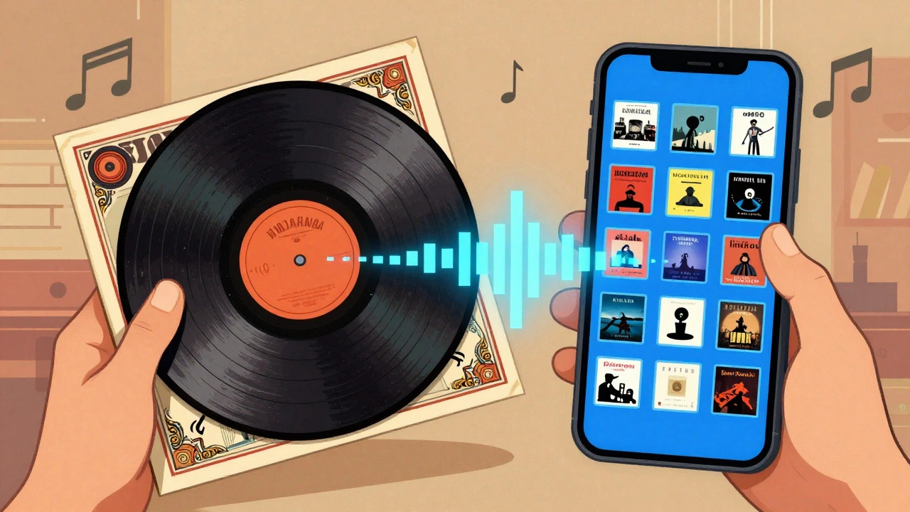
Designing for the Streaming Era
If you’re an artist today, your album cover isn’t just printed on vinyl. It’s a 150x150 pixel square on Spotify, Apple Music, and YouTube. This tiny size changes everything. Details get lost. Complex compositions become muddy blobs.
To succeed in the streaming era, you need to think like a billboard designer. Use high contrast. Keep the subject centered. Avoid fine textures that disappear at small sizes. Test your cover by shrinking it on your phone. Can you still tell what it is? Is the artist’s face recognizable? Does the title pop?
Also, remember that your cover is part of a larger ecosystem. It needs to match your press photos, your website, and your merchandise. Consistency builds trust. If your album cover looks like a indie folk record but your Instagram posts are cyberpunk neon, listeners might feel confused. Art directors advise creating a mood board with 10-50 reference images before shooting. This ensures everyone is on the same page from the start.
Best Practices for Musicians and Photographers
Whether you’re hiring a pro or shooting your own cover, follow these steps:
- Define the Concept First: Write a one-to-two-page brief. What is the album about? What emotion should the viewer feel?
- Hire for Genre Experience: A photographer who specializes in corporate headshots might not capture the grit of a punk band. Look at their portfolio. Do they understand your vibe?
- Plan for Multiple Platforms: Shoot in high resolution (above 300 dpi) for print, but also plan crops for digital thumbnails. Ensure the key elements remain visible when cropped.
- Manage Rights Early: Make sure the contract covers usage for physical packaging, digital platforms, and secondary uses like posters. Don’t wait until release day to sort this out.
- Keep Files Editable: Save layered files. You might need to adjust colors or move text later. Having the original PSD or TIFF files saves time and money.
Technical imperfections can sometimes work in your favor. Remember Bob Dylan’s *Blonde on Blonde*? The blur was intentional. It matched the songwriting. Don’t be afraid to break rules if it serves the concept. But know the rules first.
The Future of Album Art
Vinyl is back. Sales are hitting multi-decade highs. This means large-format photography is relevant again. Collectors want beautiful objects they can hold. At the same time, digital experiments are growing. NFTs, animated covers, and AR experiences are expanding what an "album cover" can be.
Yet, the core principle remains unchanged. The image is the first thing people see. It sets the expectation. It invites them in. Whether it’s a museum-worthy exhibition at The Photographers’ Gallery in London or a quick scroll on TikTok, the power of the photograph to define music is stronger than ever. As technology evolves, the need for a clear, compelling visual identity won’t fade. It will only become more critical.
Who invented the album cover?
Alex Steinweiss is credited with introducing designed album covers in 1938 while working as an art director for Columbia Records. Before him, records were sold in plain brown paper sleeves.
Why are album covers square?
Album covers are square because they were originally designed to fit the 12-inch diameter of LP vinyl records. This standard carried over to CDs and remains the default aspect ratio for digital streaming platforms.
What is the role of an art director in album production?
An art director oversees the visual concept of the album. They select photographers, approve designs, manage budgets, and ensure the artwork aligns with the artist's brand and the label's marketing strategy.
How does streaming change album cover design?
Streaming requires covers to be legible at very small sizes (often 150x150 pixels). Designers must use high contrast, bold colors, and simple compositions so the image stands out on mobile devices without getting lost in the interface.
Is photography better than illustration for album covers?
Neither is inherently better. Photography offers authenticity and immediate recognition, which helps build celebrity brands. Illustration allows for more abstract, conceptual interpretations of the music. Many successful covers blend both styles.
What resolution should I use for my album cover?
For print (vinyl/CD), use at least 300 DPI. For digital streaming, most platforms require a minimum of 3000x3000 pixels in RGB color mode to ensure high quality across all devices.