
Imagine spending months polishing an album, only for the physical merchandise to look like an afterthought. A blurry logo on a t-shirt or a misaligned sleeve design doesn't just look "cheap"-it tells your listeners that you don't care about the details. In the music industry, your visual identity is the handshake before the first note even hits. Whether you're a boutique record label or an independent artist, label branding is what turns a random piece of clothing into a collectible item that fans actually want to wear.
The goal isn't just to slap a logo on a shirt. It's about creating a cohesive system where your social media banners, vinyl sleeves, and streetwear all feel like they belong to the same universe. When you nail this, you build a level of trust and professional polish that makes people take your music more seriously.
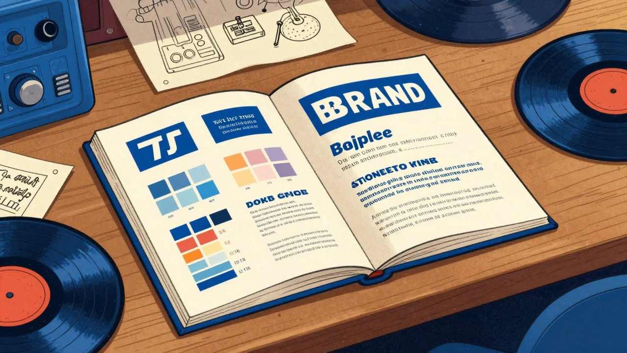
The Core of Visual Consistency
Visual consistency is the practice of using the same design DNA across every single touchpoint. Think about the biggest labels in the world; you can recognize their aesthetic from a mile away without even seeing the name. This happens because they adhere to a strict set of rules regarding Brand Style Guides is a comprehensive document that outlines exactly how a brand's visual elements should be used to ensure uniformity.
To get this right, you need to lock in four specific pillars:
- Color Palettes: Don't just pick "blue." Use specific hex codes. If your brand uses a deep royal blue to convey trust and authority, that exact shade must appear on your website, your Instagram stories, and your physical merch.
- Typography: Stick to two or three fonts max. Using a condensed sans-serif for headings and a clean serif for body text creates a predictable rhythm that the human eye finds comforting and professional.
- Logo Versions: You can't use a complex, detailed crest on a tiny wrist label. You need a primary logo, a simplified "icon" version for small spaces, and a monochrome version for dark fabrics.
- Imagery Style: Whether you use high-grain film photography or clean 3D renders, keep the vibe the same. Mixing corporate stock photos with gritty underground aesthetics creates a visual clash that confuses the audience.
Mastering Logo Placement on Sleeves
When it comes to apparel, the sleeve is prime real estate. However, most labels make the mistake of just "centering it" without considering the garment's scale or the wearer's anatomy. Proper placement is the difference between a professional garment and a DIY project.
If you're designing for different sizes, you can't use a one-size-fits-all approach. A logo that looks great on a Small will look tiny and lost on a 2XL. For adult t-shirts, aim for a width of 1-3 inches. If you're scaling up to XL or XXL, bump that width to 3-4 inches to maintain the same proportional balance. For long-sleeves, you have the luxury of verticality-you can run bold text or graphics up to 15 inches high, which is perfect for that streetwear aesthetic.
Positioning is just as critical as size. For a sporty, bold look, place the logo about 3 inches below the shoulder seam. If you're going for something more subtle, midway alignment-centered both horizontally and vertically on the sleeve-works best. Pro tip: always suggest a curved alignment to the manufacturer so the logo follows the natural contour of the arm rather than looking like a flat sticker.
| Garment Type | Recommended Width | Optimal Position | Best Application |
|---|---|---|---|
| Adult T-Shirt (S-L) | 1-3 inches | Center or near hem | Heat Transfer |
| Adult T-Shirt (XL-XXL) | 3-4 inches | Proportional scale | Screen Print |
| Youth/Women's | 2-3 inches | 1 inch higher than adult | DTG Printing |
| Long-Sleeve | Up to 15 inches (H) | Vertical arm run | Screen Print |
Technical Execution: Printing and Fabric
You can have a beautiful design, but if the printing method doesn't match the fabric, it'll peel or fade after two washes. This is where the technical side of Heat Transfer is a process where a digitally printed design is applied to fabric using heat and pressure, ideal for detailed graphics. is your best friend for complex logos with thin lines or colorful mascots, especially on polyester blends.
If you're dealing with heavy cotton and simple, bold shapes, Screen Printing is a traditional printing technique that pushes ink through a mesh screen, best for large-scale, simple designs. is the gold standard. It's durable and cost-effective for large runs, though it's less flexible for the tight spaces found on sleeves. If you want a high-end, textural feel, embroidery is the way to go for cotton, provided your logo isn't too detailed-fine lines often get "lost" in the stitching.
One of the most overlooked rules of apparel design is Placement Harmony. If you have a big logo on the left chest, put your sleeve logo on the right sleeve. Putting both on the left creates visual congestion and makes the garment feel lopsided. Balance the visual weight to create a professional flow.
Using Templates to Scale Your Brand
Decision fatigue is real. If you have to decide where the logo goes every time you make a new social media post or a new piece of merch, you'll eventually make a mistake. This is why Template-based Systems are pre-designed layouts that allow users to swap content while maintaining a fixed visual structure and brand identity. are non-negotiable for growing labels.
Stop starting from a blank canvas. Use tools like Canva or Adobe Express to build a library of "locked" templates. Create a standard frame for your album announcement, a specific color block for your tour dates, and a fixed layout for your merch drops. When the layout is locked, you can swap a photo or a date in seconds without worrying if the font size is slightly off or the logo is shifted two pixels to the left.
For teams working remotely, maintain a shared asset repository. Whether it's a cloud folder or a platform like Loom, ensure everyone has access to the latest high-res PNGs and SVG files. There is nothing worse than a team member using a low-res JPEG from 2022 because they couldn't find the official logo file.
Avoiding Common Branding Pitfalls
The biggest mistake labels make is chasing trends over authenticity. In 2025, we're seeing a huge surge in 3D geometric elements and royal blue palettes. While these look modern, don't force them into your brand if they don't fit your music's soul. A death metal label using "trendy" soft-pastel geometric shapes just feels wrong.
Avoid the temptation to "tweak" your logo for different platforms. Don't stretch it, don't rotate it 45 degrees just because it "looks cool" on one specific shirt, and definitely don't change the colors to match a random seasonal trend. Every time you alter your logo, you dilute the brand recognition you've worked so hard to build. Consistency is a repetition game; the more times a customer sees the exact same image, the faster they memorize it.
What is the best logo size for a t-shirt sleeve?
For most adult t-shirts, a width of 1 to 3 inches is ideal. However, you should scale this up to 3 to 4 inches for XL and XXL garments to ensure the logo doesn't look too small relative to the fabric area.
Should I use screen printing or heat transfer for sleeve logos?
Use heat transfer for detailed, multi-color logos with thin lines or complex characters, especially on polyester blends. Choose screen printing for bold, simple graphics on larger runs of cotton garments where durability is the priority.
How do I maintain visual consistency across different platforms?
The best way is to create a Brand Style Guide that defines your exact hex color codes, specific font pairings, and logo usage rules. Use template-based systems in tools like Canva to ensure every post follows these rules.
Where is the best place to put a logo on a sleeve?
For a bold or sporty look, place the logo approximately 3 inches below the shoulder seam. For a more subtle, balanced look, center it both horizontally and vertically on the sleeve. Always consider "Placement Harmony"-if you have a left-chest logo, put the sleeve logo on the right arm.
Can I change my logo colors to match a specific garment?
While you should generally stick to your brand colors, it's acceptable to use a monochrome (all white or all black) version of your logo to ensure it's visible on a dark or contrasting fabric. However, avoid introducing entirely new colors that aren't in your style guide.
Next Steps for Your Label
If you're just starting, don't try to build a 50-page brand book overnight. Start with the basics: pick one primary font, one accent font, and three core colors. Once those are locked, create three basic templates for your most common social media posts.
When you move into merch, order samples. Never approve a full run of 500 shirts based on a digital mockup. Digital screens lie; physical fabric doesn't. Check the stretch of the heat transfer, the feel of the screen print, and the exact placement of the sleeve logo on a real human arm. That extra step is what separates the amateurs from the professionals.


