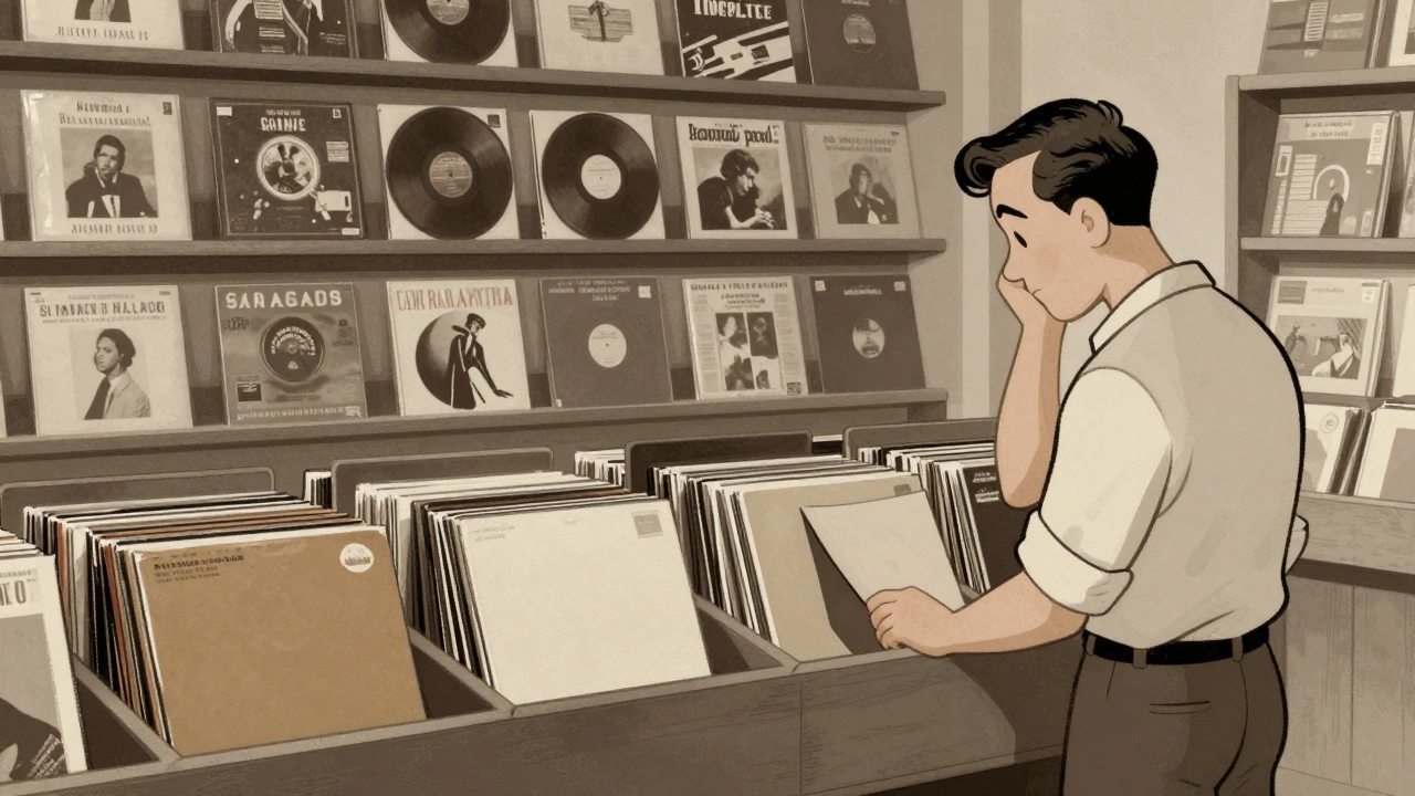

Imagine walking into a record store in 1930. You'd see rows of discs tucked into plain brown paper sleeves or boring cardboard folders. There were no flashy photos, no bold colors-just generic text telling you what the record was. It was purely functional, like buying a loaf of bread in a plain bag. But everything changed when a designer decided that music shouldn't just be heard; it should be seen. This shift didn't just change how records looked; it turned album art collecting into a global obsession where the packaging became just as valuable as the songs inside.
The Moment Packaging Became Art
The revolution started with Alex Steinweiss is a graphic designer who pioneered the concept of the artistic album cover at Columbia Records in the late 1930s. Before him, the industry didn't think visuals mattered. Steinweiss bet that a compelling image would make people buy more records, and he was dead right. In 1938, he designed the cover for Rodgers & Hart's "Richard Rodgers Conducts Rodgers & Hart," and the results were staggering-sales jumped by nearly 900%.
This wasn't just a marketing win; it was a psychological shift. For the first time, fans had something to hold that reflected the mood of the music. Steinweiss began bundling discs into packages that looked like photo albums, which is actually where the term "album" comes from. By the time Columbia Records released the 33⅓ rpm long-playing record (LP) in 1948, the industry had a massive new canvas. The larger size of the LP meant designers could finally move away from tiny labels and create sprawling, detailed pieces of art.
The 1950s: Taking Art Home
By the 1950s, the album cover stopped being a sales gimmick and became a legitimate medium for artistic expression. Designers started playing with minimalist illustrations and bold typography. Think about Frank Sinatra's "In the Wee Small Hours" from 1955. Its moody, illustrated cover didn't just describe the music; it set the emotional stage before the needle even hit the vinyl. It was the visual equivalent of a dim room and a glass of whiskey.
Fans during this era felt a new kind of ownership. Tony Bennett once mentioned that buying a record in the 50s felt like bringing home a real work of art. This is where the "collecting" mentality really took root. The cover became a keepsake. For jazz fans, having a photograph of the artist on the cover allowed them to put a face to the voice, turning a piece of plastic into a personal connection with their favorite musician.
| Era | Primary Purpose | Visual Characteristics | Fan Value |
|---|---|---|---|
| Pre-1938 | Protection | Plain brown paper, generic text | Utilitarian |
| Late 1930s - 1940s | Sales Attraction | Illustrative, "Photo-album" style | Novelty & Appeal |
| 1950s - 1980s | Artistic Identity | Abstract art, iconic photography, minimalism | Collectible Art Piece |
The Golden Age and the Rise of the Surreal
As we moved into the 60s and 70s, the "Golden Age" of vinyl saw album art evolve from simple portraits to complex, often surreal, landscapes. This is where the design firm Hipgnosis comes in. Founded by Storm Thorgerson and Aubrey Powell, this group treated album covers like cinematic productions. They didn't just take photos; they created surrealist scenes that expanded the world of the music.
Look at Pink Floyd's "Dark Side of the Moon" from 1971. The simple prism design became one of the most recognized images in human history. It proved that a cover could be as iconic as the song itself. At this point, the artwork was no longer just "supporting" the music-it was a primary part of the experience. Fans would spend an entire album cycle sitting on the floor, staring at the gatefold art and reading the liner notes, treating the record sleeve like a gallery exhibition in their own living room.
Why We Still Crave the Visual
Why does this matter today in a world of streaming? Because the emotional link between a sound and an image is incredibly strong. The transition from those early brown wrappers to the wild designs of the 70s showed that humans crave a multi-sensory experience. When you collect a vinyl record today, you aren't just buying the audio-you're buying the physical manifestation of the artist's vision.
The commercial success of early artistic covers proved that people are willing to pay a premium for beauty. Whether it was Jim Flora's irreverent, campy illustrations in the late 40s that signaled a break from "their parents' music" or the high-concept art of the prog-rock era, visual components have always served as a bridge between the artist's intent and the fan's interpretation.
Who invented the artistic album cover?
Alex Steinweiss is credited with inventing the artistic album cover in 1938 while working at Columbia Records. He shifted the industry away from plain brown packaging to visually compelling designs, which famously increased record sales by nearly 900% for his first major project.
Why was the LP format so important for album art?
The introduction of the 33⅓ rpm long-playing record (LP) in 1948 provided a much larger physical surface area. This expanded "real estate" allowed designers to create more detailed and ambitious artwork, transforming the sleeve from a protective folder into a legitimate canvas for art.
What was Hipgnosis's contribution to album art?
Hipgnosis, led by Storm Thorgerson and Aubrey Powell, moved album art into the realm of surrealism and high-concept photography. Their work, most notably the prism for Pink Floyd's "Dark Side of the Moon," helped turn album covers into cultural icons that were as famous as the music itself.
Did album art always feature the musician's face?
Not always. While many artists, especially in the American jazz scene, used photographs to create a visual connection with their audience, there was a strong trend toward replacing photos with paintings, abstract illustrations, and experimental designs to evoke a specific mood or theme.
How did early album art affect sales?
It had a massive impact. Before artistic covers, records were generic. Once Alex Steinweiss introduced visually appealing artwork, it became a powerful tool for catching a buyer's eye on retail shelves, leading to dramatic increases in sales and establishing the visual identity of the music industry.
What to do if you're starting a collection
If you're looking to dive into album art collecting, don't just go for the most expensive "holy grail" records. Look for specific designers or eras that speak to you. For example, if you love mid-century modernism, seek out 1950s jazz pressings. If you're into surrealism, hunt for early Hipgnosis-designed sleeves. Always check the condition of the corners and the spine, as the visual integrity of the sleeve is what makes it a piece of art rather than just a used record. Start by identifying the "visual mood" of your favorite albums and see how the artwork enhances the listening experience.


