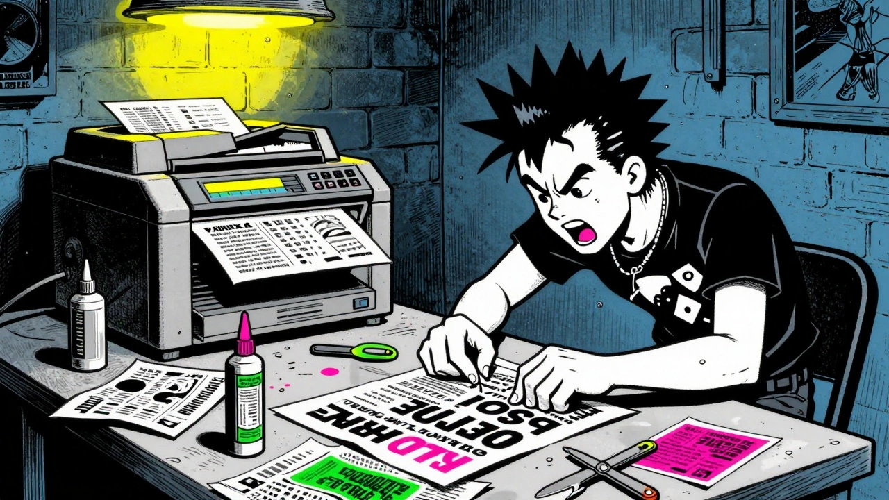

Imagine a flyer that looks like it was assembled in a panic at 2 AM. The text is jagged, cut from different newspapers. The photo is grainy and blown up until you can see the individual dots of the photocopier. It smells faintly of toner and glue. This isn't bad design; it's punk design. Between 1980 and 1989, these rough, hand-made posters were the lifeblood of the underground music scene. They advertised shows, sold records, and screamed political messages to anyone who looked at a telephone pole.
Today, we treat these scraps of paper as high art. Museums hang them on white walls. Designers study their layouts. But back then, they were cheap, disposable, and necessary. If you wanted to get people to a basement show in Los Angeles or a squatted warehouse in London, you couldn't afford an ad agency. You had to make it yourself. This is the story of how a lack of money created one of the most influential visual styles in modern history.
The Tools of Rebellion
You didn't need a computer to start a revolution in the 1980s. You needed scissors, glue, and access to a copy shop. The technology available to punk bands was limited, but that limitation forced creativity. Most flyers were made using office photocopiers like the Xerox 9400 or Canon NP series. These machines produced black-and-white copies with a resolution of about 200-400 dpi. That low resolution created the signature "grainy" look that defines the era.
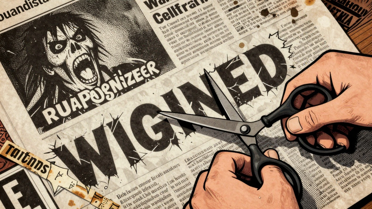
The process was physical and messy. A band member would spend hours cutting images from horror movie ads, comic books, and tabloid newspapers. They used X-Acto knives to slice out faces and headlines. Then, they arranged these pieces on a paste-up board using rubber cement. For text, they often used Letraset dry-transfer sheets-stick-on letters that cost a few dollars per sheet-or just wrote by hand with markers. If they wanted color, they might use a cheap silkscreen setup with neon pink or green ink, influenced by the new wave movement.
Once the layout was done, they headed to the local copy shop. In the early 1980s, a letter-size copy cost between US$0.05 and US$0.10. Printing 200 copies for a show might cost under US$20. Compare that to today, where digital distribution is free but attention is expensive. Back then, the barrier to entry was literally just a handful of coins and some patience.
Visual Language: Weaponizing Ugliness
The look of 1980s punk flyers wasn't accidental. It was a direct attack on the polished, corporate design of the time. While mainstream advertising embraced clean lines and perfect grids (think Swiss Modernism), punk designers deliberately broke every rule. They used "ransom-note" typography, where each letter was a different size, font, and angle. They over-enlarged photos so the halftone dots became visible patterns. They placed text diagonally across the page, ignoring standard reading paths.
This style drew heavily from earlier art movements. Dada artists like Hannah Höch used photomontage to disrupt meaning in the 1920s. Situationist Internationalists used détournement, hijacking existing media to send subversive messages. Punk flyers did the same thing. They took images of politicians, religious figures, or war photographers and collaged them with band names and gig dates. The result was chaotic, aggressive, and impossible to ignore.
Raymond Pettibon, who designed many flyers for Black Flag in Los Angeles, took this further. His work combined stark black-and-white cartoons with handwritten captions. It felt personal and urgent. Design writer Steven Heller called Pettibon’s work "a one-man underground school of graphic narrative." It proved that you didn't need professional training to create powerful visuals; you just needed a point of view.
Regional Styles and Scenes
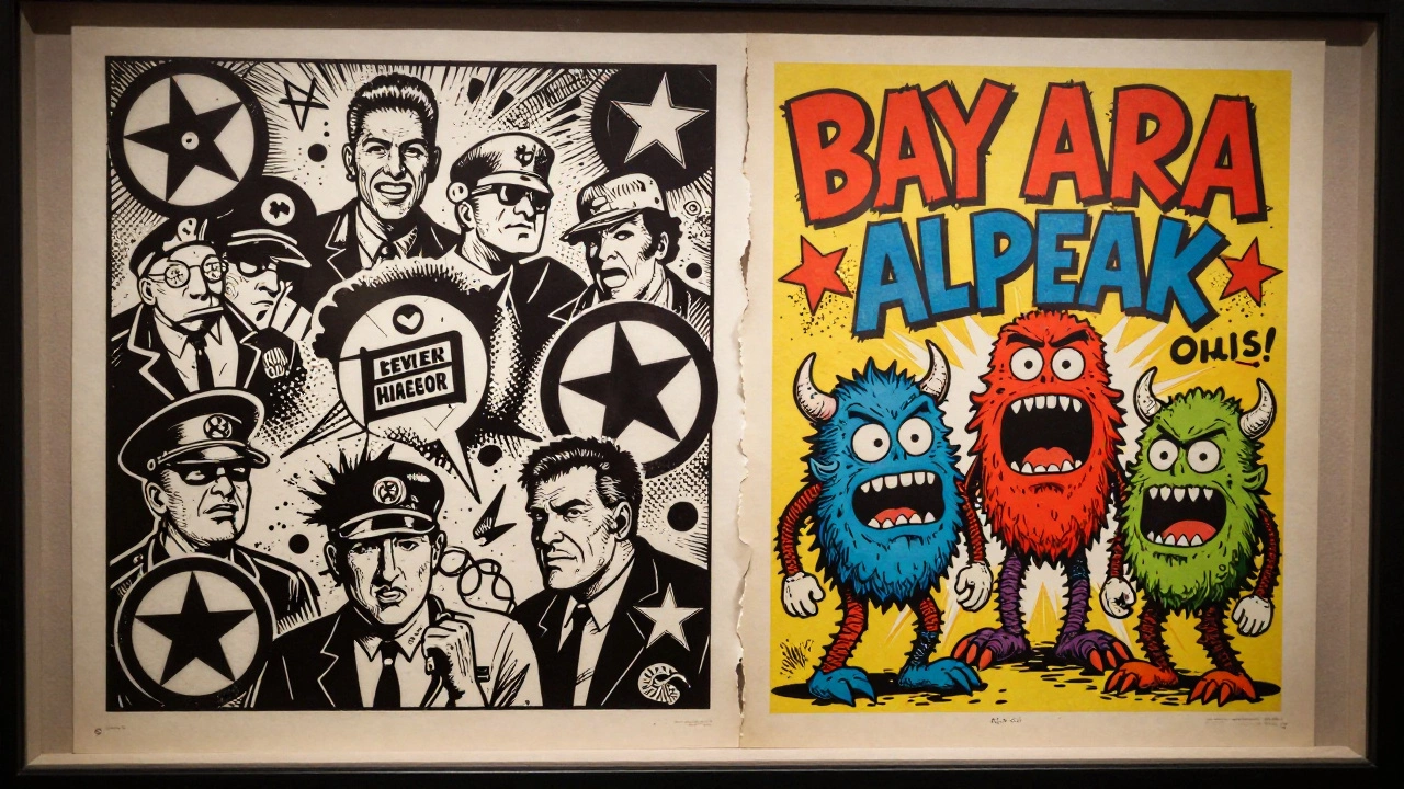
While the core DIY ethic was universal, regional scenes developed distinct visual identities. In the UK, anarcho-punk bands like Crass and Flux of Pink Indians produced dense, black-and-white photomontages. Designer Gee Vaucher’s work for Crass featured repeated imagery of authority figures mixed with anti-war slogans. These flyers looked like political broadsides, reflecting the intense political focus of the British scene.
In the United States, the West Coast offered a different vibe. The Bay Area, centered around venues like the 924 Gilman Street Project in Berkeley, produced hundreds of flyers featuring bold hand-lettering and cartoonish monsters. Bands like Operation Ivy and Green Day benefited from this vibrant, community-driven aesthetic. The Letterform Archive in San Francisco holds over 200 of these Bay Area flyers, showcasing a style that was energetic and slightly more playful than its UK counterpart.
On the East Coast, particularly in Washington, D.C., the straight-edge hardcore scene favored minimalism. Dischord Records releases by Minor Threat and Fugazi often used stark, simple layouts. A single photo, a sans-serif font, and essential information. No clutter. No nonsense. This reflected the disciplined, sober ethos of the straight-edge movement. It showed how visual design could reinforce musical and cultural values.
From Underground to Museum Walls
What started as ephemeral trash is now considered critical design history. The Museum of Arts and Design in New York held a major exhibition titled "Too Fast to Live, Too Young to Die: Punk Graphics, 1976-1986." It displayed around 400 objects, including flyers, record sleeves, and zines. Curators argued that these works visualized DIY ethics and anti-authoritarian politics in a way that traditional art forms couldn't.
Academic institutions have followed suit. Cornell University Library digitized over 2,000 punk flyers from their rare manuscripts collection. Scholars analyze these documents to understand how underground communities organized themselves. They look at ticket prices (often $3-$7), venue addresses, and band lineups to map the social networks of the era. These flyers are no longer just advertisements; they are primary historical sources.
This institutionalization has raised questions. Critics argue that putting punk flyers in museums neutralizes their rebellious energy. When a xeroxed flyer becomes a collectible artifact priced at hundreds of dollars, does it lose its meaning? Dick Hebdige, a cultural theorist, warned in 1979 that subcultural styles are eventually commodified. Today, streetwear brands like Supreme use collage and photocopy textures in their marketing. The aesthetic has been absorbed into the mainstream, even if the politics haven't.
Creating the Look Today
If you want to create a flyer that looks like it belongs in 1982, you don't need to hunt down a vintage photocopier. Digital tools can emulate the analog imperfections. Tutorials on platforms like Envato Tuts+ show designers how to use Adobe Photoshop and InDesign to achieve this look. The process involves creating a grid, importing photos, and applying halftone filters.
Here’s a quick breakdown of the digital workflow:
- Halftone Effects: Convert images to grayscale and apply a color halftone filter. Set the maximum radius to around 8 pixels to mimic the dot pattern of old printers.
- Texture Layers: Add PNG overlays of paper texture, scuffs, and noise. Use blending modes like "Multiply" to integrate them naturally.
- Typography: Use fonts that mimic typewriters, stencils, or hand-cut letters. Avoid clean, modern sans-serifs unless you're going for the DC minimalist look.
- Distortion: Slightly skew or rotate elements. Imperfect alignment adds to the handmade feel.
However, there's a difference between emulation and authenticity. As some designers note on forums like Reddit, using these techniques for a shoe advertisement is a stylistic choice. Making a flyer because you have no other option is a necessity. The context changes the meaning. Still, learning these techniques helps contemporary designers break free from rigid brand guidelines and inject more energy into their work.
Why It Matters
The legacy of 1980s punk flyers extends far beyond music promotion. They challenged the idea that good design requires expensive software and professional training. They proved that constraints can fuel creativity. By rejecting the polished aesthetics of corporate America, punk designers paved the way for later movements like grunge typography in the 1990s. David Carson’s work in Ray Gun magazine, which featured illegible text and distressed type, owes a debt to the punk pioneers.
Moreover, these flyers democratized visual communication. Anyone with access to a copy shop could participate. This lowered the barrier to entry for self-expression and allowed marginalized voices to be seen. In an age where algorithms control what we see online, the raw, unfiltered nature of punk flyers feels refreshingly human. They remind us that design isn't just about selling products; it's about connecting people and sharing ideas.
How much did it cost to make a punk flyer in the 1980s?
A typical run of 200 black-and-white copies cost less than US$20. Individual copies ranged from $0.05 to $0.10 each at local copy shops like Kinko's. Materials like paper, glue, and Letraset sheets added minimal cost.
What tools were used to create 1980s punk flyers?
Creators used office photocopiers (Xerox, Canon), X-Acto knives, scissors, rubber cement, magazines/newspapers for source images, markers for hand-lettering, and sometimes silkscreen kits for color. Letraset dry-transfer sheets were popular for typography.
Where can I see original 1980s punk flyers?
Digital collections are available at Cornell University Library (over 2,000 items) and the Letterform Archive in San Francisco. Physical exhibitions have been held at the Museum of Arts and Design in New York. Auction houses like Sotheby's also sell rare originals.
Did punk flyers influence modern graphic design?
Yes. The deliberate rejection of typographic rules and use of distressed imagery anticipated the grunge typography of the 1990s. Elements of ransom-note style and collage have since been adopted by fashion brands, advertising agencies, and UI designers seeking a retro or edgy aesthetic.
What is the difference between UK and US punk flyer styles?
UK flyers, especially from the anarcho-punk scene, tended to be dense, political photomontages resembling broadsides. US West Coast flyers were often more colorful, cartoonish, and hand-lettered. US East Coast hardcore flyers favored stark minimalism and clean photography.


