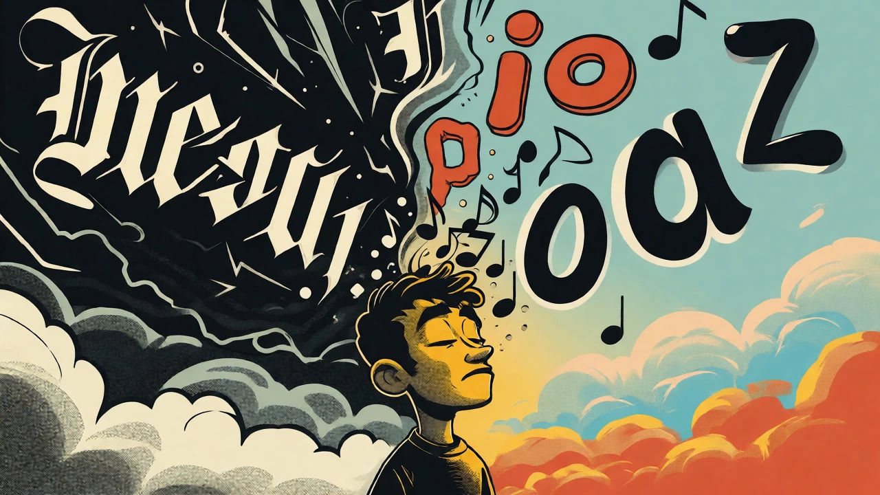

Imagine you are scrolling through a streaming playlist. You have less than two seconds to decide if an album is worth your time. What catches your eye? It isn't usually the melody-you haven't heard it yet. It's the square image. And within that square, typography is doing the heavy lifting. It tells you who the artist is, what genre they play, and how the music might make you feel before a single note plays.
This isn't just about picking a pretty font. It's about visual communication, a discipline where letterforms act as cultural signals. In this article, we'll break down how text on album covers shapes listener expectations, why historical shifts changed the game, and how modern digital constraints force designers to rethink every pixel.
The Power of Letterforms in Music Branding
Think of typography on an album cover as the voice of the record before it speaks. When you see jagged, aggressive blackletter fonts, you expect heavy metal. When you see clean, minimalist sans-serifs, you anticipate electronic or indie pop. This isn't accidental; it's learned behavior. Research confirms that typeface choice directly influences auditory perception. A study published in Psychology of Aesthetics, Creativity, and the Arts found that angular typefaces led participants to expect music that was faster, rougher, and more exciting. Conversely, rounded typefaces made listeners expect smoother, calmer, and sadder sounds.
This psychological priming is crucial for artists. If a folk singer uses a techno-style font, the mismatch creates cognitive dissonance. The listener feels confused rather than intrigued. Effective music branding relies on consistency between the visual cue (the font) and the auditory reality (the song). Designers use specific attributes-stroke width, curvature, spacing-to encode these meanings. For instance, tight tracking can create a sense of urgency or claustrophobia, while wide letterspacing often signals elegance or space.
A Brief History of Text on Covers
It wasn't always this way. Before the late 1930s, record sleeves were boring. They were plain paper jackets with minimal labeling. That changed when Alex Steinweiss, Columbia Records' first art director, decided that packaging should reflect the music inside. His 1939 cover for "Smash Song Hits" by Rodgers and Hart is widely credited as the first modern illustrated album cover. He didn't just add a picture; he integrated hand-drawn lettering that matched the theatrical energy of the songs.
This innovation turned the album sleeve into a canvas. By the 1950s and 60s, designers like Reid Miles at Blue Note Records used bold, asymmetric typography to capture the rhythm of jazz. Miles treated text as a graphic element, cropping and scaling words to match the intensity of the photography. Later, punk and post-punk movements embraced distressed, cut-and-paste aesthetics, rejecting polish for raw emotion. Today, we inherit all these styles. Whether you choose a sleek digital font or a gritty scan of a handwritten note, you are referencing decades of visual language.
Semiotics: How Text Communicates Culture
Text on an album is never neutral. It carries cultural weight. Semioticians like Roland Barthes distinguished between denotation (what the text literally says) and connotation (what it implies culturally). A serif font might denote "history," but it connotes "tradition," "authority," or even "pretension," depending on the context.
Consider global markets. In Pakistani album design, the choice between Romanized Urdu and traditional Nastaliq script signals different things. Romanized text often appeals to youth culture and modernity, while Nastaliq invokes traditional authority. Bilingual designs acknowledge multiple audiences simultaneously. This shows that typography is a negotiation. It bridges the gap between the artist's intent and the listener's background knowledge. If you ignore these codes, your design might alienate the very audience you want to reach.
Digital Constraints: The Thumbnail Test
The biggest shift in recent years isn't aesthetic-it's technical. We no longer hold a 12-inch vinyl sleeve in our hands. We view albums as tiny squares on phone screens. This has forced a radical change in how we approach album cover art.
Platforms like Spotify and Apple Music have strict rules. Spotify requires artwork to remain unaltered, prohibiting overlays or blurring. Apple Music demands perfect squares, typically at least 4,000 × 4,000 pixels, and bans clutter like prices, websites, or barcodes. But beyond compliance, there's usability. Can you read the title at 150 × 150 pixels? If not, it fails.
| Feature | Physical Vinyl/CD | Digital Streaming |
|---|---|---|
| Primary View Size | Large (12 inches) | Tiny (Thumbnail ~150px) |
| Legibility Focus | Complex hierarchy, small credits | Bold titles, minimal text |
| Contrast Needs | Subtle gradients work well | High contrast essential |
| Allowed Elements | Barcodes, lyrics, liner notes | Artist name, title only |
Designers now practice "responsive identity." They create a master system that looks good on a poster but simplifies gracefully for a smartphone. Thin strokes disappear on small screens. Complex scripts become illegible blobs. The rule of thumb? If you can't recognize the artist and title in a blink, simplify.
Accessibility and Contrast Rules
We often forget that not everyone sees the world the same way. Accessibility guidelines, such as those from the W3C, recommend a minimum contrast ratio of 4.5:1 for normal text. While album art is artistic, not functional UI, ignoring contrast hurts users with low vision. Black text on a dark blue background might look moody on a high-end monitor but vanish on a cheap phone screen in sunlight.
Test your design in grayscale. If the text blends into the background without color assistance, it lacks structural contrast. Also, consider legibility versus readability. Legibility is recognizing individual letters; readability is comfortably reading a block of text. On covers, we mostly care about legibility of short titles. Avoid decorative fonts for critical information. Save the weird, experimental typefaces for texture, not for the tracklist or artist name.
Practical Workflow for Designers
If you're designing a cover, start with the brief. Who is the artist? What is the genre? Who is the target audience? Then, move to concept. Don't just pick a font from a list. Sketch ideas. Does the title need to be huge? Should it interact with the image?
- Select Typefaces Carefully: Choose one primary face for the title and a secondary, highly readable face for credits. Limit yourself to two or three families max.
- Establish Hierarchy: Decide what matters most. Usually, it's the artist name or the album title. Make it bigger, bolder, or higher contrast.
- Check Licensing: Ensure you have commercial rights to use the fonts. This is especially tricky with custom or open-source fonts.
- Test at Scale: Zoom out until the image is tiny. Does it still communicate? Zoom in to check details. Is it crisp?
- Cross-Platform Check: Preview how it looks against dark and light backgrounds, as platforms vary their interface themes.
Remember, typography is inexpensive compared to hiring a photographer or illustrator, but it’s powerful. A unique logotype can become iconic, instantly recognizable across merchandise, social media, and posters. It builds brand equity that lasts longer than a single hit song.
Frequently Asked Questions
Why does font choice matter so much for album covers?
Font choice sets expectations for the music's mood and genre. Psychological studies show that angular fonts suggest excitement and aggression, while rounded fonts suggest calmness and sadness. It primes the listener's brain before they press play.
What are the current size requirements for digital album art?
Most major platforms like Apple Music require a square image with a minimum resolution of 4,000 x 4,000 pixels. However, the design must also be legible at thumbnail sizes, often around 150 x 150 pixels, which is how most users will first see it.
Can I put my website URL on the album cover?
Generally, no. Platforms like Apple Music explicitly prohibit URLs, social media handles, prices, and dates on the main artwork. These elements are considered promotional clutter and are better placed in metadata or physical liner notes.
How do I ensure my text is accessible?
Maintain a high contrast ratio between text and background, ideally 4.5:1 or higher. Avoid placing text over busy images without a solid backing shape or shadow. Test your design in grayscale to ensure visibility doesn't rely solely on color differences.
Who started using typography on album covers?
Alex Steinweiss, the first art director at Columbia Records, is widely credited with revolutionizing album packaging in the late 1930s. He moved away from plain sleeves to illustrated covers with integrated, expressive typography, setting the standard for the industry.