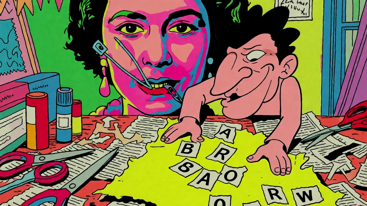

You’ve seen the safety pin through the Queen’s cheek. You’ve recognized the four black bars of Black Flag on a t-shirt or a wall. But did you know that these images weren’t just cool graphics? They were weapons. In the mid-1970s, punk didn’t just change how music sounded; it changed how we see things. It took the polished, expensive look of mainstream culture and smashed it with scissors, glue, and a photocopier. This wasn’t an accident. It was a deliberate choice to make art accessible, aggressive, and undeniable.
If you’re trying to understand why punk looks the way it does, you have to look beyond the chords. The visual language of punk-its album art, its zines, and its flyers-is a history lesson in itself. It’s about who gets to speak, how they get heard, and what happens when you refuse to play by the rules of professional design. Let’s break down how this messy, beautiful chaos became one of the most influential visual movements of the last fifty years.
The British Explosion: Collage as Conflict
In London, around 1976, the visual identity of punk was forged in fire. At the center of this storm was Jamie Reid, a graphic artist who worked closely with Malcolm McLaren and the Sex Pistols. Reid didn’t hire a studio photographer. He didn’t use clean fonts. Instead, he used a technique called détournement, borrowed from the Situationist International movement. This meant taking existing cultural images-like official portraits of royalty-and twisting them until they meant something completely different.
Think about the cover for Never Mind the Bollocks, Here’s the Sex Pistols. It’s not subtle. It uses ransom-note lettering, where each letter is cut out from a different newspaper or magazine. Why? Because it looked urgent. It looked like a threat. The fluorescent yellow and pink backgrounds weren’t chosen because they were pretty; they were chosen because they hurt your eyes. They screamed. When Reid defaced the portrait of Queen Elizabeth II for the God Save the Queen single, adding a safety pin through her eye and mouth, he wasn’t just being rude. He was saying that the monarchy was broken, pinned down, and unable to speak freely.
This approach rejected the idea that design had to be smooth. Traditional advertising wanted you to trust the brand. Punk wanted you to feel uncomfortable. The rough edges, the mismatched typefaces, and the grainy photocopies signaled that this wasn’t made by a corporation. It was made by people who cared more about the message than the polish.
Zines: The Voice of the Underground
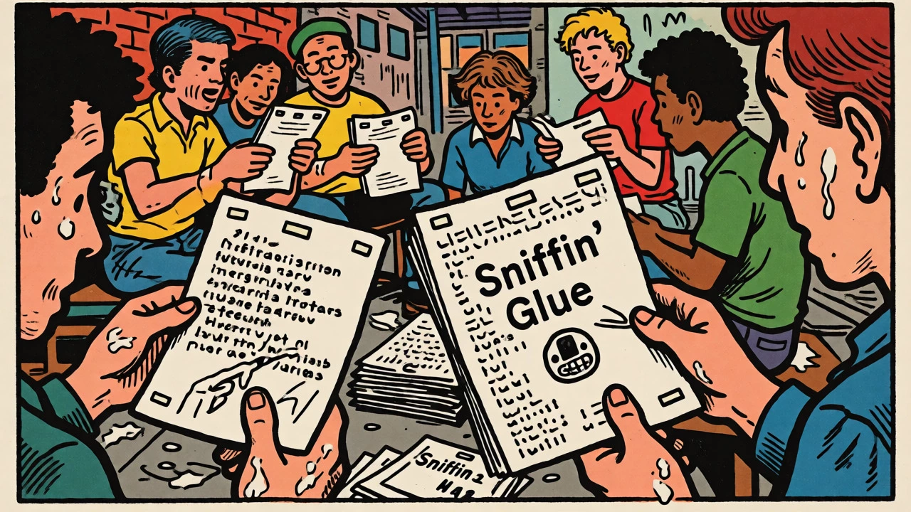
If album covers were the billboards of punk, zines (short for fanzines) were the newsletters. These were small, self-published magazines that bypassed traditional publishing houses entirely. You didn’t need a degree to write one. You needed a typewriter, some scissors, a bottle of glue, and access to a photocopier.
The first major British punk zine, Sniffin’ Glue, appeared in July 1976. Mark Perry, its creator, saw the Ramones perform at the Roundhouse and decided he had to document it immediately. He typed up his thoughts on a child’s typewriter and pasted them onto paper. There was no editor checking his grammar. No fact-checker verifying his claims. It was raw, immediate, and personal.
Zines did more than review records. They created a community. Before social media, if you lived in a small town in England and loved hardcore punk, you might feel isolated. Reading a zine from London, or swapping addresses in the back pages, connected you to a network. Publications like Maximum Rocknroll, which started in San Francisco in the early 1980s, listed band addresses, tour dates, and political articles. They turned scattered fans into a cohesive scene. The physical act of making a zine-cutting, pasting, stapling-was part of the point. It showed that anyone could participate. You didn’t need permission to have an opinion.
| Creator/Figure | Region/Era | Visual Style Characteristics | Key Works/Media |
|---|---|---|---|
| Jamie Reid | UK / Mid-1970s | Ransom-note typography, collage, fluorescent colors, détournement of royal imagery. | Never Mind the Bollocks, Sex Pistols singles. |
| Raymond Pettibon | US / Late 1970s | Stark black ink drawings, literary references, minimalist composition, irony. | Black Flag logo, SST Records sleeves, Sonic Youth covers. |
| Mark Perry | UK / 1976-1977 | Typewritten text, felt-tip annotations, low-fi photocopy aesthetic. | Sniffin’ Glue zine. |
| Art Chantry | Seattle / Early 1990s | Dense handmade graphics, distressed printing, pop-culture irony. | Sub Pop releases, Mudhoney albums, local theater posters. |
American Hardcore: Ink and Irony
Across the Atlantic, the visual language evolved differently. In Southern California, Raymond Pettibon became the visual architect of hardcore punk. Unlike Reid’s colorful collages, Pettibon’s work was stark. He used black ink on white paper. His drawings were often unsettling, featuring figures with exaggerated expressions or cryptic captions that referenced literature, comics, and politics.
Pettibon designed the iconic four-bar logo for Black Flag. It’s simple: four vertical lines. But it’s powerful. It works on a record sleeve, a sticker, a tattoo, or spray-painted on a wall. It’s instantly recognizable. This simplicity was strategic. Hardcore punk moved fast. Bands toured constantly. Flyers needed to be printed quickly and cheaply. A complex image would blur on a cheap photocopier. A bold black line wouldn’t. Pettibon’s style matched the music: direct, intense, and stripped of excess.
His work also introduced a layer of intellectualism to punk visuals. While many assumed punk was anti-intellectual, Pettibon’s captions often quoted writers like Henry Miller or Jack Kerouac. This challenged the stereotype of the dumb punk. It suggested that aggression and literacy could coexist. Today, institutions like the Getty Museum hold his archives, proving that underground flyers can become high art.
The Power of Imperfection
One of the biggest misconceptions about punk aesthetics is that they were lazy. Critics sometimes dismiss the crooked letters and blurry photos as signs of poor skill. But that misses the point. The imperfections were intentional. They were features, not bugs.
When you look at a punk flyer, the misaligned text tells you something. It says, "We made this ourselves." It rejects the corporate polish that hides the human hand behind the product. In a world of airbrushed perfection, punk offered something real. The visible glue marks, the uneven margins, and the handwritten notes added texture. They invited the viewer to engage with the object as a physical thing, not just an image.
This philosophy extended to distribution. Zines were sold at gigs, traded via mail, or left on park benches. They weren’t locked in bookstores. They were everywhere. This accessibility democratized culture. You didn’t need money to start a conversation. You just needed a voice and a way to share it.
Legacy and Modern Relevance
So, why does this matter today? Because the principles of punk visual communication are still alive. Every time a designer uses a glitch effect, every time a musician self-publishes their album art on Bandcamp, every time someone creates a meme using a low-resolution screenshot, they are tapping into the punk tradition.
Modern digital tools allow us to mimic the analog look easily. We can add grain filters or choose "ransom note" fonts in Photoshop. But true punk aesthetics aren’t just about the look. They’re about the method. It’s about bypassing gatekeepers. It’s about prioritizing expression over production value. It’s about community building through shared visual codes.
Museums now celebrate this era. The Victoria and Albert Museum and the Tate hold pieces by Jamie Reid. Exhibitions showcase the evolution from vinyl sleeves to digital scans. Yet, there’s a tension here. When rebellion becomes museum-worthy, does it lose its edge? Some argue that commodifying punk turns it into a fashion statement. Others believe that preserving these artifacts ensures future generations understand the power of DIY culture.
Ultimately, punk aesthetics teach us that design is never neutral. Every font, color, and layout carries meaning. By breaking the rules, punk artists expanded our visual vocabulary. They proved that you don’t need a big budget to make a big impact. You just need something to say, and the courage to say it loudly.
What is the difference between punk album art and mainstream album art?
Mainstream album art typically aims for commercial appeal, using professional photography, polished typography, and clear branding to attract buyers. Punk album art, conversely, often employs collage, appropriation, rough textures, and confrontational imagery. Its goal is not necessarily to please but to provoke, signal authenticity, and reject corporate polish.
Why were zines important to the punk scene?
Zines served as alternative media channels that bypassed traditional publishing. They allowed fans and musicians to share news, reviews, political views, and personal stories directly. This fostered a sense of community among geographically dispersed participants and empowered individuals to contribute to the cultural dialogue without needing approval from established media outlets.
Who was Jamie Reid and what was his contribution to punk aesthetics?
Jamie Reid was a British graphic artist best known for his work with the Sex Pistols. He pioneered the use of ransom-note typography, collage, and détournement (subverting existing images). His designs, such as the defaced portrait of Queen Elizabeth II, defined the visual identity of UK punk by combining political provocation with aggressive, non-traditional graphic styles.
How did Raymond Pettibon influence American punk visuals?
Raymond Pettibon shaped the visual identity of US hardcore punk, particularly through his work with Black Flag. His style featured stark black-and-white ink drawings, literary references, and ironic captions. He created the iconic four-bar Black Flag logo, which became a symbol of DIY ethics and minimalist aggression, influencing countless bands and designers in the subsequent decades.
Is punk aesthetics still relevant in the digital age?
Yes, punk aesthetics remain relevant. The core principles-DIY production, challenging authority, and valuing authenticity over polish-continue to inspire contemporary design, independent music packaging, and online culture. Digital tools often mimic analog punk techniques, and the ethos of self-publishing remains central to modern independent creators.
