
You know that feeling when you see a logo and instantly know the genre before reading a single word? That’s the power of 1970s band typography. It wasn't just about picking a font from a menu; it was about carving an identity into vinyl sleeves, stage backdrops, and concert tickets. If you're trying to brand a new rock or metal band today, looking at how bands like Led Zeppelin, KISS, and Yes handled their visual identity in the '70s gives you a masterclass in doing more with less.
Why the 1970s Changed Band Branding Forever
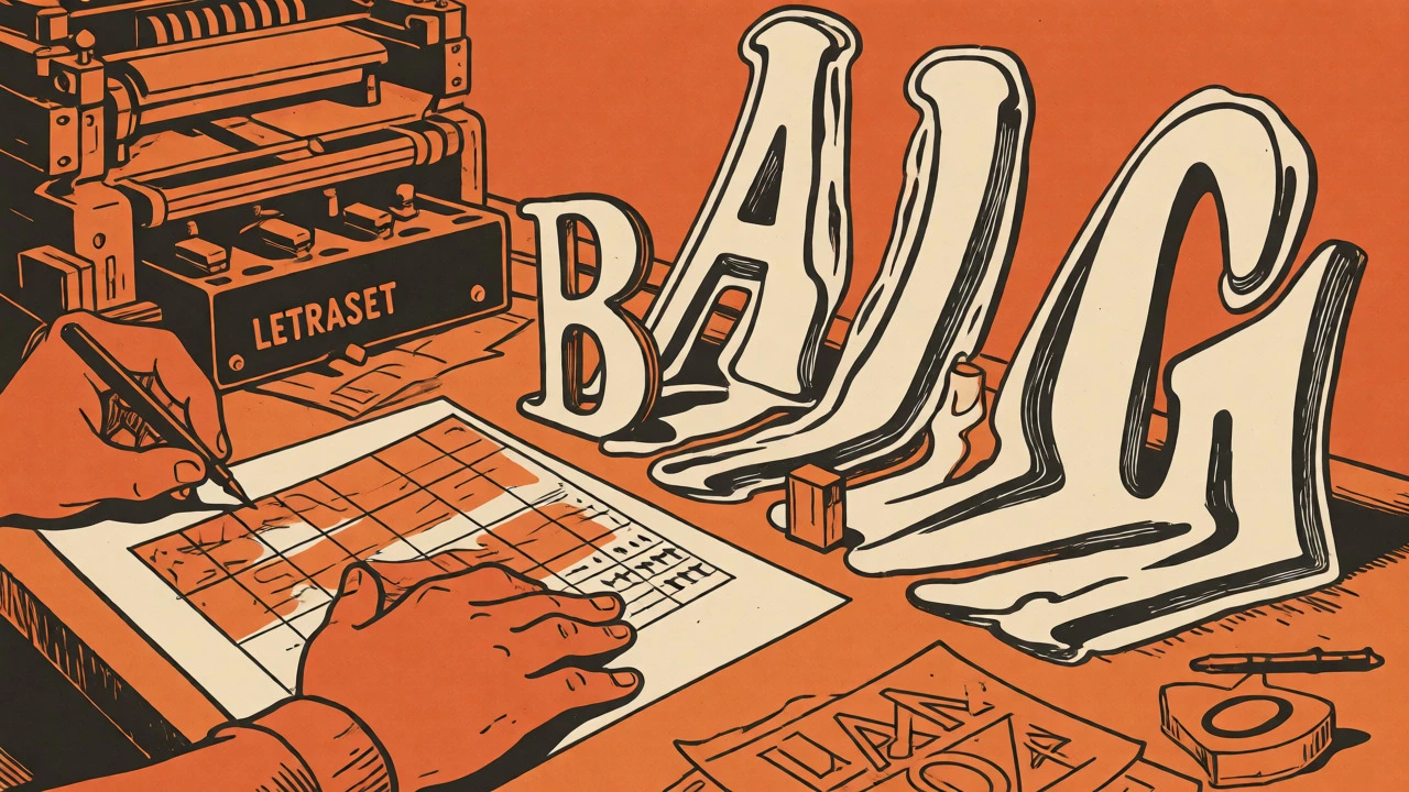
The 1970s were a wild time for design because technology shifted. Before this era, lettering was often hand-drawn or set in rigid metal type. Then came phototypesetting and tools like Letraset. Suddenly, designers could rub transfer letters onto artwork or use machines to stretch, overlap, and distort characters. This freedom meant letters stopped being just text. They became images. You could make them bleed, melt, or look like they were exploding. This technical shift allowed bands to create logos that felt as loud and aggressive as their music. It wasn't just a name on a cover; it was a visual shout.
This era also saw the rise of the gatefold sleeve. With four panels of space, designers had room to play. The logo didn't have to sit quietly in a corner. It could dominate the front, interact with photography, or even be hidden inside. This context forced designers to think about scalability. A logo had to work on a giant poster but also on a tiny record label or a black-and-white photocopy flyer. That constraint bred simplicity and strength. Today's digital-first world has similar constraints-your logo needs to work as a tiny Instagram avatar and a large banner-but the '70s taught us how to build that resilience first.
Decoding the Visual Language of Rock and Metal
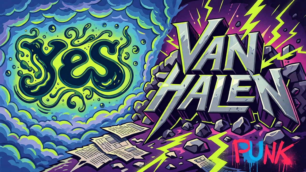
Not all 1970s fonts looked the same. Different genres developed distinct typographic codes. Progressive rock bands like Yes used organic, flowing lines. Roger Dean’s famous logo for Yes connected the letters in a way that felt alien and magical, matching the complex, fantasy-inspired music. It wasn't readable in a traditional sense, but it was unforgettable. In contrast, hard rock and early heavy metal leaned into sharp angles and heavy weights. Think of the metallic, blocky construction of Van Halen’s monogram or the eerie, funereal lettering of Black Sabbath. These choices weren't accidental; they signaled to the audience exactly what kind of sonic experience to expect.
Punk rock, emerging late in the decade, rejected polish entirely. Designers used ransom-note styles, stencils, and photocopied textures. The goal was anti-establishment. If prog rock was about precision and wonder, punk was about chaos and immediacy. When you design for a modern band, ask yourself: What is the emotional core of the music? Is it warm and nostalgic (like funk or disco)? Or is it cold and industrial? Your typography should answer that question before the listener hits play. Organic curves suggest warmth and humanity; sharp diagonals suggest energy and danger; geometric sans-serifs suggest precision and modernity.
Case Studies in Iconic Lettering
Let's look at some specific examples that define this era. The Rolling Stones' "Tongue and Lips" is technically a symbol, not a wordmark, but it functions as their primary identifier. Created by John Pasche in 1970, it proved that a compact emblem could carry more weight than a name. It worked everywhere-from VIP passes to T-shirts-because it relied on shape recognition rather than spelling. Similarly, KISS used lightning bolts for their Ss. Ace Frehley sketched the initial concept, and Paul Stanley refined it. The result was aggressive and memorable, though it caused legal issues in Germany due to its resemblance to Nazi insignia. This teaches us a crucial lesson: always check your symbols against cultural contexts in different markets.
| Band | Designer/Creator | Typographic Strategy | Brand Impact |
|---|---|---|---|
| Yes | Roger Dean | Organic, interconnected calligraphy | Merged logo with fantasy album art; defined prog-rock aesthetic |
| KISS | Ace Frehley / Paul Stanley | Lightning-bolt 'S's, high-contrast silhouette | Instant recognition; faced international legal scrutiny |
| ABBA | Rune Söderqvist | Inverted second 'B' pointing inward | Visually represented the two couples in the group; clean and pop-friendly |
| Led Zeppelin | Jimmy Page / Band Members | Individual member sigils (no standard wordmark) | Created mystery; encouraged fan interpretation and bootleg culture |
| Van Halen | Dave Bhang (Art Director) | Symmetrical metallic 'VH' monogram | Communicated hard-rock force through geometric repetition |
Another brilliant example is ABBA. Designer Rune Söderqvist inverted the second 'B' so it pointed toward the other letters. It subtly referenced the fact that the band consisted of two couples. It’s a simple tweak, but it added a layer of meaning without cluttering the design. Led Zeppelin took a different route by abandoning a standard logo altogether. Instead, they used four unique symbols representing each member. This created an aura of secrecy. Fans had to decode who was who. It showed that sometimes, hiding information is more powerful than revealing it.
Practical Rules for Modern Band Logo Design
If you're designing a logo today, don't just copy the '70s blindly. Use the principles. First, ensure legibility at small sizes. Test your logo at 16 pixels wide. Does it still look like your band? Many retro designs fail here because they rely on thin lines or complex textures that disappear on mobile screens. Second, aim for one controlled abnormality. Look at the KISS logo again. Everything else is fairly standard, but those lightning-bolt Ss are distinct. That single change makes the whole mark memorable. Don't try to distort every letter; pick one element to break the rules.
- Start with sketches: Do not open Illustrator immediately. Draw 30 thumbnails in black and white. Focus on shape and weight, not color.
- Test reproducibility: Can your logo be embroidered on a jacket patch? Can it be screen-printed on a cheap t-shirt? If it relies on gradients or tiny details, it will fail in the real world.
- Check for cultural conflicts: As seen with KISS, symbols can mean different things in different countries. Research your target markets before finalizing.
- Define the system: Create versions for horizontal use, vertical stacking, and standalone icons. A band needs flexibility for social media avatars, album spines, and tour banners.
Also, consider the medium. Digital streaming platforms favor bold, high-contrast shapes. Physical merchandise favors durable, simple lines. A good '70s-inspired logo bridges this gap by being structurally sound. Avoid excessive distress or grunge effects unless they serve a purpose. Punk bands used rough edges to signal rebellion, but if your band plays polished jazz-fusion, jagged edges might send the wrong message. Match the texture to the tone.
Avoiding Common Pitfalls in Retro Branding
The biggest trap is pastiche. There's a difference between being influenced by the '70s and looking like a costume. If your logo looks like it belongs in a museum exhibit rather than on a Spotify playlist, you've gone too far. Modern audiences appreciate authenticity. They want to feel the heritage, but they also want relevance. Keep the typography clean. Let the attitude come from the structure, not from fake stains or overly decorative flourishes.
Another issue is attribution. Many famous logos were designed by band members themselves, not big agencies. John Pasche was a student when he designed the Stones' tongue. Ace Frehley drew the KISS logo on a napkin. This DIY spirit is part of the charm. If you're a musician, sketch your own ideas. You know the vibe better than any designer. Collaborate, but stay involved. And remember, clarity beats cleverness. If people can't read your band's name, they can't search for you. Make sure the typography serves the name, not the other way around.
Do I need to hire a professional designer for my band logo?
Not necessarily. Many iconic logos from the 1970s, such as those for KISS and The Rolling Stones, were created by band members or students. However, a professional can help refine your sketches, ensure vector quality, and test for trademark issues. If you have strong drawing skills, start with your own concepts and seek feedback.
How do I test if my logo works for digital platforms?
Scale your logo down to 16x16 pixels and 32x32 pixels. View it in grayscale. If the main shape or letters become muddy or indistinguishable, simplify the design. Remove fine details and increase stroke weight. Ensure it remains recognizable against both light and dark backgrounds.
What is the risk of using 1970s-style typography today?
The main risks are illegibility at small sizes and potential cultural misinterpretation. Complex, distorted letterforms may vanish on mobile devices. Additionally, certain symbols (like the SS-like shapes in the KISS logo) can have unintended historical or political connotations in specific regions. Always conduct a cultural review for your target markets.
Can I use a standard font for my band logo?
You can, but custom lettering is preferred for uniqueness. Standard fonts are easier to license and reproduce, but they lack the distinctive character of hand-drawn marks. If you use a standard font, modify it significantly-stretch, overlap, or join letters-to create a proprietary look that distinguishes your band from others using the same typeface.
Why did Led Zeppelin use symbols instead of a logo?
Led Zeppelin wanted to maintain anonymity and mystery. By using individual symbols for each member on their fourth album, they avoided commercial branding conventions. This strategy engaged fans who enjoyed decoding the meanings, creating a deeper connection and allowing the music to stand apart from typical marketing imagery.
