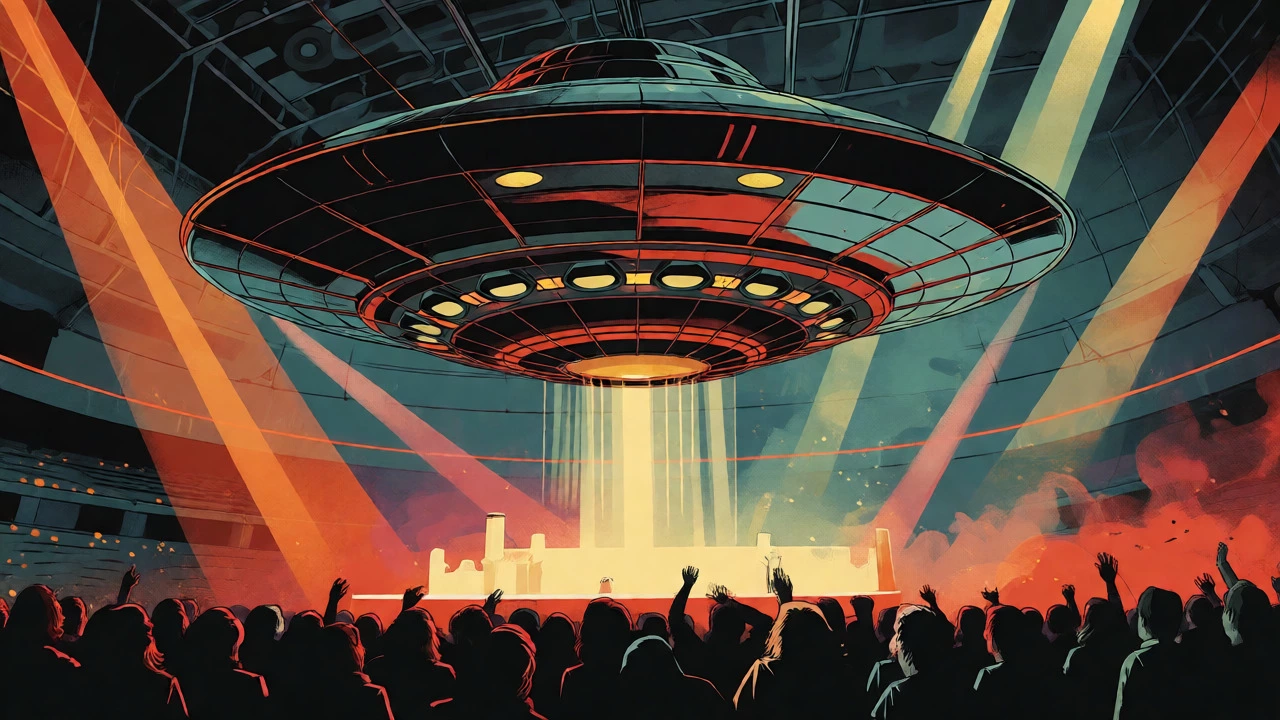

You buy an album. You stare at the cover for hours, memorizing every pixel, every color gradient, every hidden symbol. Then you go to the concert, and suddenly, that flat image is breathing around you. The lights match the palette. The set mimics the geometry. It’s not a coincidence-it’s live performance integration, the strategic translation of an album’s visual identity into the physical environment of a concert stage. This isn’t just about looking cool; it’s about creating a seamless narrative loop that turns listeners into believers.
Think about Electric Light Orchestra in 1978. Their album "Out of the Blue" featured a jukebox-style flying saucer. On tour, they didn’t just project that image-they built it. A massive, literal spacecraft hung over the stage. That was the primitive version. Today, artists like Taylor Swift or The Killers don’t just copy-paste their covers. They build worlds. They use the album art as a blueprint for lighting cues, video mapping, and even wardrobe choices. If you’re an artist or a designer, understanding this connection is no longer optional. It’s how you survive in a market where fans expect a cohesive brand from Spotify thumbnails to arena seats.
The Evolution From Literal Copying to World Building
In the early days, integration was simple mimicry. If the cover showed a face, the stage might feature a giant mask. ELO’s 1978 tour is the classic example here. The band literally recreated the album’s iconic spaceship on stage. It worked because the technology was limited, and the novelty was high. But as production tech advanced, so did expectations. By 2014, when Daft Punk performed at the Grammys, the approach shifted. Designer Alexander Schaedler didn’t just slap the "Random Access Memories" cover on a screen. He built a recording studio set inspired by architect John Lautner, capturing the *vibe* of the album-retro sci-fi nostalgia-rather than its literal pixels. This marked a turning point: designers started asking, "What does this album feel like?" instead of "What does this album look like?"
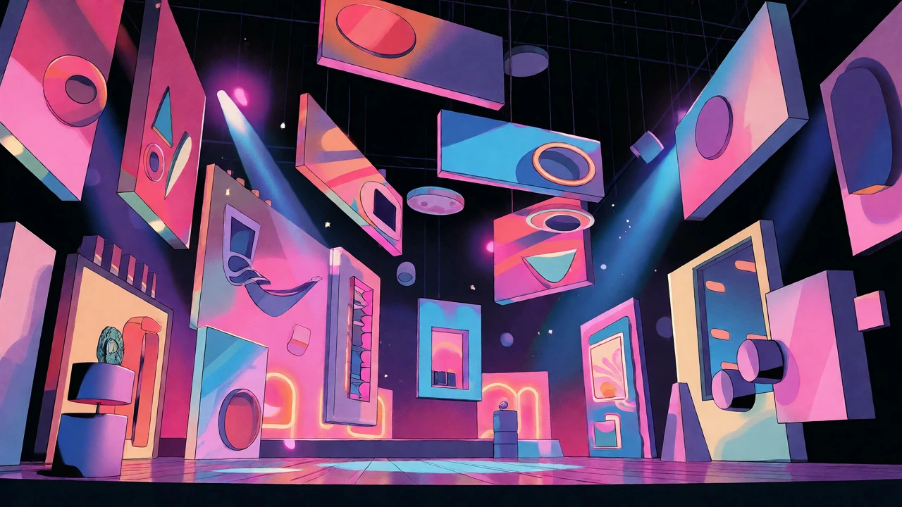
This evolution accelerated with Logic’s 2018 "Everybody" tour. Creative director Jeff Maker and partner Rachel Stoll treated the stage like a museum gallery. They used floating video panels arranged asymmetrically, mirroring the collage style of Sam Spratt’s album artwork. It wasn’t one big image; it was a curated experience of multiple fragments coming together. This allowed the audience to feel like they were walking through the album’s concept, not just watching a backdrop. The shift from static replication to dynamic interpretation meant that stage design became a storytelling tool, extending the album’s narrative into three-dimensional space.
Case Studies: When Visuals Go Live
To understand how this works in practice, let’s look at recent tours that nailed the integration. Carrie Underwood’s 2019 "Cry Pretty" tour is a masterclass in architectural adaptation. The album cover features a striking eye motif. Lighting designer Nick Whitehouse took that symbol and made it structural. The entire stage was shaped like an eye, measuring 165 feet wide. The blue and purple hues from the cover weren’t just background colors; they were the primary palette for every lighting cue. Interestingly, the process was iterative. The logo used in some tour materials was actually inspired by the final stage design, proving that album art and stage design can feed each other in real-time.
| Artist/Tour | Integration Strategy | Key Visual Element | Impact on Audience |
|---|---|---|---|
| ELO (1978) | Literal Reproduction | Flying Saucer Structure | Immediate recognition; novelty factor |
| Daft Punk (2014) | Conceptual Homage | Retro Studio Architecture | Immersive nostalgia; atmospheric depth |
| Logic (2018) | Modular Fragmentation | Floating Video Panels | Museum-like exploration; dynamic focus |
| Taylor Swift (2023) | Narrative Zoning | Era-Specific Color Palettes | Emotional journey; chronological clarity |
| The Killers (2024) | Environmental Extension | Desert Landscapes & Neon | World-building; immersive context |
Glass Animals’ 2021 "Dreamland" tour took a different route. The album cover is pastel, surreal, and dreamlike. Scenic Solutions didn’t just print the cover on a banner. They fabricated physical elements using NuNeon technology to bring those candy-floss colors into the room. The stage felt like stepping inside a lucid dream. Similarly, Taylor Swift’s "Eras Tour" divided the stage into distinct zones, each representing a different album era. Each zone had its own color palette and lighting scheme derived directly from the corresponding album covers. This turned the concert into a visual timeline, allowing fans to physically move through her career’s aesthetic shifts.
The Technical Toolkit: How It’s Done
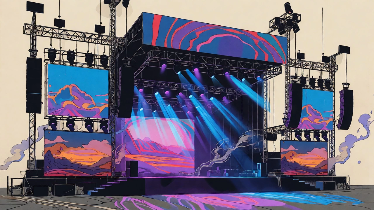
So, how do designers pull this off? It’s not magic; it’s modular engineering. Most modern integrations rely on three pillars: programmable LED surfaces, scenic fabrication, and media servers. For The Killers’ "Imploding the Mirage" tour, Moment Factory used a massive background screen flanked by tall video-lighting pillars. These weren’t just screens; they were structural supports that doubled as content displays. The upstage and downstage tiers allowed content to flow between them, creating depth. This setup let them map desert landscapes and psychedelic distortions onto the architecture, making the album’s themes surround the performers.
Lighting plays a huge role here too. In the "Cry Pretty" case, the blues and purples from the cover were programmed as base palettes. This means every spotlight, wash, and effect was filtered through those specific hues, ensuring visual consistency even during chaotic musical moments. Designers often extract two or three dominant colors from the album art and lock them in as anchor hues. This prevents the show from feeling disjointed when switching between songs. Additionally, tools like Miraflow’s AI prompt templates are becoming popular for generating consistent visuals. Artists can use the same prompt structure for album covers, tour posters, and projected stage content, ensuring symbols and styles remain coherent across all touchpoints.
Best Practices for Artists and Designers
If you’re trying to integrate your album art into your live show, start before you book the venue. New Lease Music suggests a six-stage workflow that begins with defining your brand adjectives. Pick three words that describe your music’s vibe. Then, choose two symbols and one color mood. Build a mini-kit with these elements: specific fonts, photo styles, and graphic shapes. Apply this kit to your releases first. Then extend it to merch. Finally, translate it to the stage.
- Define Your Core: Lock in three adjectives, two symbols, and one color mood before designing anything else.
- Create a Mini-Kit: Standardize your fonts, photo lighting, and graphic shapes to ensure consistency.
- Apply Across Media: Use the kit for album art, social banners, and lyric videos to test its versatility.
- Translate to Stage: Coordinate backdrops, lighting colors, and wardrobe to reinforce the story set by the album.
- Review and Adjust: Watch fan reactions. If a visual element confuses people, tweak it for the next tour leg.
A common pitfall is overcomplicating the visual vocabulary. Experts favor restraint. Don’t try to cram every detail from the cover into the stage design. Instead, focus on materiality and color resonance. If your album is gritty and black-and-white, don’t introduce neon pinks unless there’s a strong narrative reason. Consistency builds trust. When fans see the same visual language on Instagram, on the ticket stub, and on the stage, they feel like they’re part of an exclusive club. They understand the artist’s world without needing a manual.
The Future of Visual Branding
We are moving toward a future where the line between digital and physical disappears. With AI tools generating consistent assets and LED technology becoming cheaper and more flexible, even independent artists can achieve high-level integration. The trend is shifting from "buying an album" to "experiencing a brand." Agencies like Monart and Riot NYC now offer services that bundle album art, social media kits, and stage concepts into single packages. This reflects a market expectation: your visual identity must be cohesive everywhere.
There’s no hard data on ROI yet, but anecdotal evidence is strong. Fans spend more time engaging with artists who provide a coherent visual story. They share photos from concerts that match their album aesthetics. They buy merch that extends the look. As virtual concerts and hybrid events grow, this integration will only become more critical. The stage is no longer just a platform for sound; it’s the physical manifestation of your sonic identity. Treat your album art not as a wrapper, but as a blueprint for your entire live experience.
Why is matching stage design to album art important?
It creates a cohesive visual brand that reinforces the artist's identity. When fans see familiar colors, symbols, and moods from the album cover in the live setting, it deepens their emotional connection and makes the concert feel like an extension of the recorded work, rather than a separate event.
Can small independent artists afford this kind of integration?
Yes. While large tours use expensive LED walls and custom builds, indie artists can achieve integration through low-cost methods. Using consistent color gels on standard lights, printing banners with album motifs, and choosing wardrobe that matches the album's palette can create a unified look without a massive budget.
What is the difference between literal reproduction and conceptual homage?
Literal reproduction involves copying the album cover directly onto the stage, such as building a prop seen on the cover. Conceptual homage interprets the mood, themes, or color palette of the album to create an atmosphere. For example, Daft Punk’s retro studio set was a conceptual homage to the nostalgic vibe of 'Random Access Memories,' not a direct copy of the cover image.
How do lighting designers use album art?
Designers often extract the dominant colors from the album cover and use them as the base palette for lighting programming. They may also reference the composition of the cover to determine where light sources should be placed or how shadows should fall, ensuring the live lighting feels like a natural extension of the recorded artwork.
Does this integration help with merchandise sales?
Indirectly, yes. A strong visual brand makes merchandise more desirable because it allows fans to take home a piece of the experience. When merch graphics match the stage and album art, it validates the purchase as part of the artist's official world, increasing perceived value and collectibility.


