
You’re scrolling through Spotify on your phone. The song starts, but before a single note hits, you see a square image. Maybe it’s a white brick wall. Maybe it’s a man in a glittery jumpsuit standing on a London street. That tiny thumbnail isn’t just decoration. It’s the first chapter of the story. Concept album covers are deliberate visual systems designed to match, extend, or even complicate the musical narrative inside. They don’t just tell you who is singing; they tell you what world you are entering.
This isn’t about pretty pictures. It’s about coherence. When done right, the cover art and the music become inseparable parts of a single artistic statement. Think about how weird it would feel if The Dark Side of the Moon had a picture of a puppy on the front. The prism doesn’t just look cool; it signals the themes of light, time, and mental fragmentation that the songs explore. This article breaks down how artists and designers use visual language to build these narratives, why some covers work while others fail, and how you can spot the difference between generic art and true visual storytelling.
From Brown Wrappers to Art Galleries
It wasn’t always this way. In the late 1930s, records came in plain brown paper sleeves. They were purely functional-meant to protect the fragile shellac discs from scratches. Then Alex Steinweiss, hired by Columbia Records as their first art director, changed everything. He realized people wanted to buy the music based on how it looked. He started adding illustrations and typography. Suddenly, the record sleeve became a billboard, a piece of art, and a collector’s item all at once.
This shift turned the album cover into a "paratext"-a term scholars use for the material that surrounds and frames the main text. The cover mediates your listening experience. Before you press play, the image sets expectations. If you see a gritty, black-and-white photo, you expect raw emotion. If you see bright, surreal colors, you expect experimentation. The cover primes your brain for the journey ahead.
The Grammar of Visual Narrative
How do you turn sound into sight? Designers use a specific visual grammar. This involves three layers: denotation, connotation, and composition.
- Denotation: What is literally shown. Is it a person? A landscape? An object?
- Connotation: What does that thing mean culturally? A skull might denote death, but in an album context, it could connote rebellion, mortality, or a past era.
- Composition: How the elements are arranged. Negative space can suggest isolation. Clutter can suggest chaos. Scale can make a character feel small against a big world.
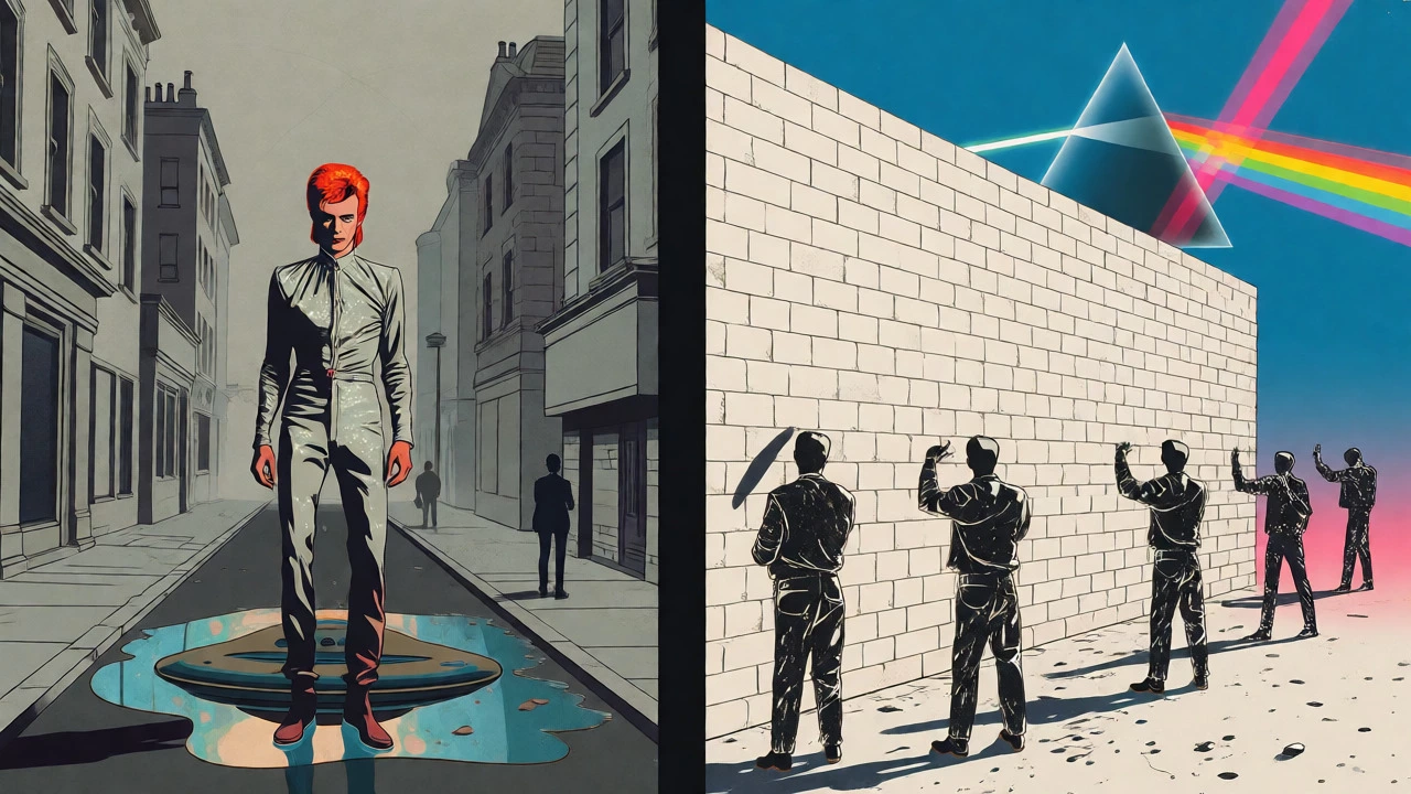
Take David Bowie’s The Rise and Fall of Ziggy Stardust and the Spiders from Mars. The cover shows Bowie in full alien glam attire, standing on Heddon Street in London. It’s not a fantasy landscape. It’s a real, mundane English street. This creates immediate tension. The visual story isn’t just "here is an alien." It’s "here is an alien invading our ordinary reality." That conflict is the core of the album’s narrative. The cover doesn’t show the whole plot; it shows the premise.
Case Study: Pink Floyd’s The Wall
If there is one example of perfect alignment between image and music, it’s Pink Floyd’s The Wall, released in 1979. The original cover was stark white with no text, no band name, no title. Just a wall. Or rather, the absence of one until you removed the shrink-wrap sticker.
The concept, driven by Roger Waters and illustrated by Gerald Scarfe, used minimalism to force participation. You had to engage with the physical object to understand the context. But the real storytelling happened inside. As you flipped through the gatefold, the wall was built up in stages: one-quarter erected on side one, half on side two, and so on. The inner artwork included sketches of the characters-the teacher, the wife, the prosecutor-linking the visual progression directly to the musical arc of isolation and breakdown.
This is sequential visual storytelling. The physical format of the vinyl allowed the narrative to unfold over time, mirroring the double-album structure. It proved that a cover could be more than a snapshot; it could be a timeline.
Case Study: Beyoncé’s Lemonade
Fast forward to 2016. Beyoncé released Lemonade, not just as an audio album, but as a visual album. While the traditional cover art was important, the visual narrative extended across twelve video chapters, poetry, and social media imagery. The static cover served as an anchor, but the story lived in the motion.
| Feature | Traditional Concept Cover (e.g., Sgt. Pepper) | Expanded Visual Narrative (e.g., Lemonade) |
|---|---|---|
| Primary Medium | Static Image (Vinyl/LP) | Multimedia (Video, Social, Merch) |
| Narrative Scope | Implied World/Persona | Explicit Story Arc/Chapters |
| Audience Interaction | Interpretive (Viewer fills gaps) | Guided (Director leads viewer) |
| Platform Constraint | Square Thumbnail | Screen Ratio & Motion |
Beyoncé’s project demonstrated how visual storytelling can tackle complex social themes like infidelity, Black womanhood, and historical trauma. The visuals didn’t just accompany the songs; they provided context that the lyrics alone couldn’t convey. For many listeners, seeing the imagery transformed the meaning of the words. It showed that modern concept albums often require a multi-platform approach to fully deliver the narrative.
Design Principles for Modern Artists
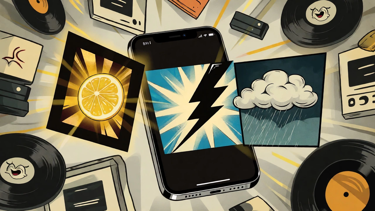
If you’re an artist or designer trying to create a concept cover today, you face new challenges. Most people will never hold a vinyl record. They’ll see your art as a 64-pixel icon on a smartphone screen. So, how do you maintain narrative depth when the canvas is so small?
First, start with a brief. Don’t just ask "what looks cool?" Ask: Who is the protagonist? What is the conflict? What is the emotional trajectory? Write this down. Then, translate it into visual symbols. If the album is about loss, maybe the color palette is desaturated. If it’s about anger, maybe the typography is jagged and aggressive.
Second, test for legibility. Your cover needs to work at three sizes:
- Full Size: For vinyl buyers and posters. Here, you can include fine details, hidden Easter eggs, and complex textures.
- Medium Size: For CD booklets and web banners. Ensure the central figure or symbol is still clear.
- Thumbnail Size: For Spotify, Apple Music, and Instagram. Does the image still communicate the mood? Can you distinguish the artist from the background?
Third, consider ambiguity. The best covers don’t explain everything. They invite interpretation. If the cover gives away the entire plot, you lose the mystery. Leave room for the listener to project their own feelings onto the image. Sgt. Pepper’s Lonely Hearts Club Band works because it’s a collage of references. You don’t need to know every face to get the vibe of cultural overload and theatrical reinvention.
Pitfalls to Avoid
Not every attempt at visual storytelling lands. Here are common mistakes:
- Over-explaining: Using a literal illustration of the song’s plot can make the album feel like a children’s book. It leaves no room for imagination.
- Ignoring the Platform: Designing a beautiful vertical poster for a square streaming interface. The crop ruins the composition. Always design for the square first, then expand for physical formats.
- Cultural Mismatch: Using symbols that have different meanings in different cultures without research. A color that means mourning in one country might mean celebration in another.
- Generic Tropes: If your "concept" is just a moody portrait with fog, you’re competing with thousands of other albums. Specificity sells. Give us a unique angle, a strange detail, a specific setting.
The Future of Visual Narratives
We are moving toward responsive design. Artists now create a master visual identity that adapts. One core image might spawn animated loops for social media, sequential panels for deluxe vinyl box sets, and simplified icons for app interfaces. The goal is consistency across touchpoints.
Technology also offers new possibilities. Augmented Reality (AR) allows fans to point their phones at a physical cover and see the story come to life. Some projects integrate QR codes that lead to interactive websites or exclusive video content. However, the fundamental principle remains: the visual must serve the music. If the art distracts from the sound, it fails. If it enhances it, it becomes timeless.
Concept album covers are more than marketing tools. They are entry points. They give listeners a key to unlock the emotional and thematic depths of a record. In a world of infinite choice, a strong visual narrative helps an album stand out, stick in memory, and resonate on a deeper level. Whether it’s a brick wall, a prism, or a lemon slice, the image tells you: pay attention, this story matters.
What defines a concept album cover?
A concept album cover is a visual design that deliberately aligns with the album's musical narrative, themes, or characters. Unlike standard cover art that may simply feature a photo of the artist, a concept cover establishes a visual premise-such as a specific setting, persona, or symbolic system-that invites the listener to interpret the music within a broader story or emotional framework.
Why is Alex Steinweiss important to album cover history?
Alex Steinweiss is credited with inventing the modern record cover. Hired by Columbia Records in 1938, he replaced plain brown wrappers with illustrated sleeves, transforming the album package from a purely protective container into a piece of advertising and art. His innovation established the cover as a critical component of an album's commercial and artistic identity.
How should I design album art for streaming platforms?
Design primarily for a square aspect ratio (1:1). Ensure high contrast and simple shapes so the image remains recognizable at thumbnail size (as small as 64x64 pixels). Avoid fine details that disappear when scaled down. Test your design at various sizes to ensure the central subject or symbol is clear without relying on text, which may be unreadable on mobile screens.
Can a concept cover contradict the music?
Yes, and this can be effective. Irony or juxtaposition between the visual and auditory elements can add layers of meaning. For example, upbeat pop music paired with dark, melancholic imagery can create cognitive dissonance that engages the listener. However, the contradiction must be intentional to enhance the narrative rather than confuse the audience.
What is the role of gatefolds in visual storytelling?
Gatefolds allow for sequential or panoramic visual narratives that cannot fit on a single square cover. They enable designers to spread images across multiple panels, creating a timeline, a map, or a detailed scene that unfolds as the user opens the package. This format supports deeper engagement and is particularly effective for concept albums with complex lore or linear stories.