
There was a time when buying an album meant more than just getting the music. You held something physical - a heavy cardboard sleeve, a glossy front, a hidden message on the back. The 1970s didn’t just produce great records; it produced visual icons. These weren’t just labels on a box. They were portals. A single glance could tell you if you were stepping into a psychedelic dreamscape, a gritty urban reality, or a mythic fantasy world. And for millions, that image became inseparable from the sound inside.
The Canvas That Changed Everything
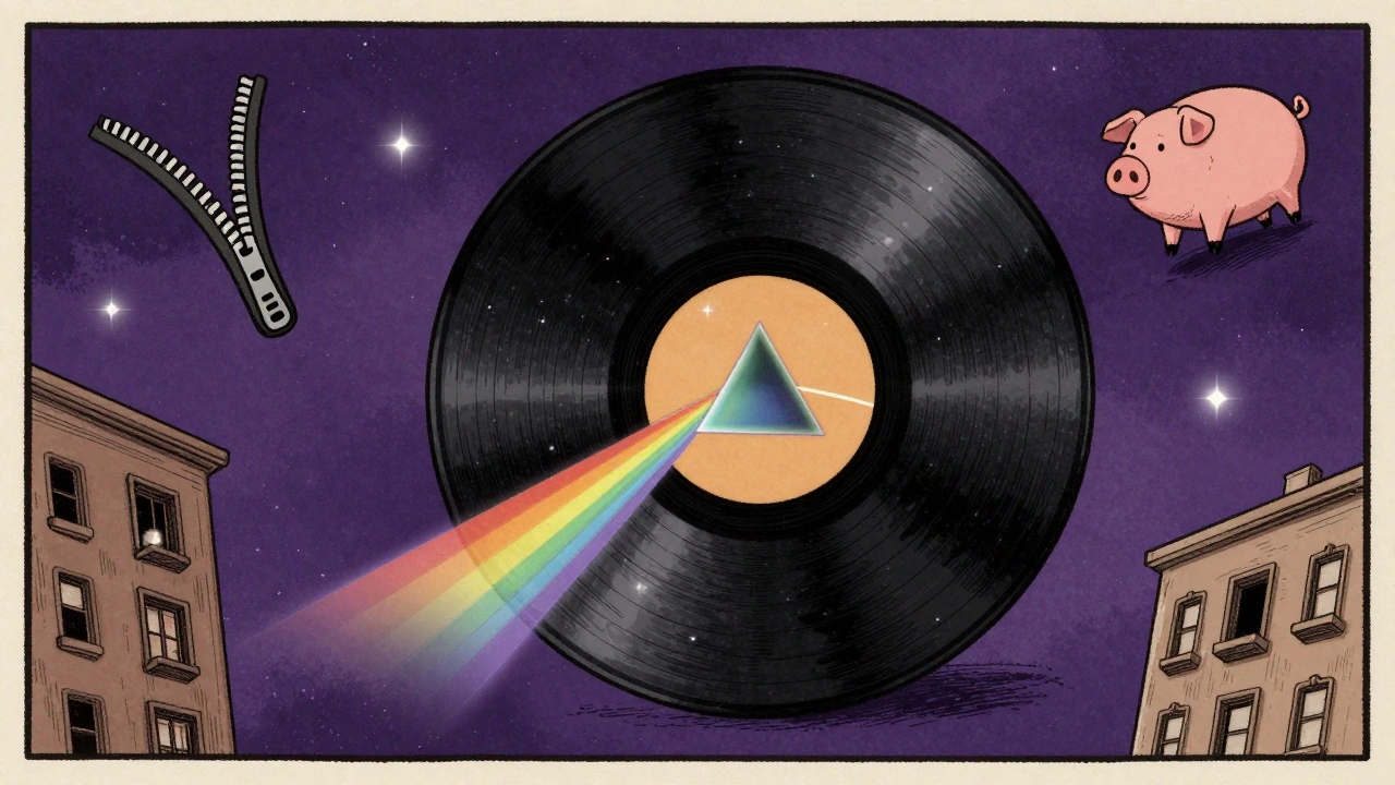
The LP was 12.375 inches square. That’s bigger than a standard poster. For the first time, album art had room to breathe. No more cramped band photos or generic logos. Artists and designers had a real canvas. Gatefold sleeves doubled that space, turning the cover into a diorama. Pink Floyd’s The Dark Side of the Moon didn’t just show a prism - it made you stop, stare, and wonder what it meant. The black background wasn’t empty. It was a void waiting to be filled with light. And when you opened it, the rainbow didn’t just appear - it felt like a revelation.
That cover was designed in 20 minutes. No sketchbook. No revisions. Just a simple idea: light through glass. But that simplicity hid years of technical mastery. Four-color printing had gotten good enough to reproduce that exact shade of cyan and magenta without bleeding. The result? A cover so clean, so precise, it looked like it came from another dimension. It wasn’t just art. It was science made visible.
When the Cover Became a Machine
Some covers didn’t just sit there - they moved. The Rolling Stones’ Sticky Fingers had a real zipper. Not a printed one. A metal zipper that actually worked. It cost 35 cents more per unit. That might sound tiny, but in 1971, that meant thousands of extra dollars. And it paid off. People didn’t just buy the album - they interacted with it. They pulled the zipper. They showed friends. They worried about it scratching other records. According to a 2020 Vinyl Me, Please survey, nearly half of collectors who owned early pressings had at least one damaged record because of it. The zipper wasn’t just a gimmick. It was a conversation starter. A rebellion against the idea that music was just something you played in the background.
Then there was Led Zeppelin’s Physical Graffiti. Open the cover, and you didn’t just see a photo - you saw a New York tenement building. Pull back a flap, and another window opened. Another floor. Another life. It was like flipping through a city. The die-cut technique required custom molds and precise alignment. One misaligned print meant a whole batch had to be scrapped. But the result? A cover that felt alive. Like the band was inviting you into their world, one apartment at a time.
The Artists Behind the Images
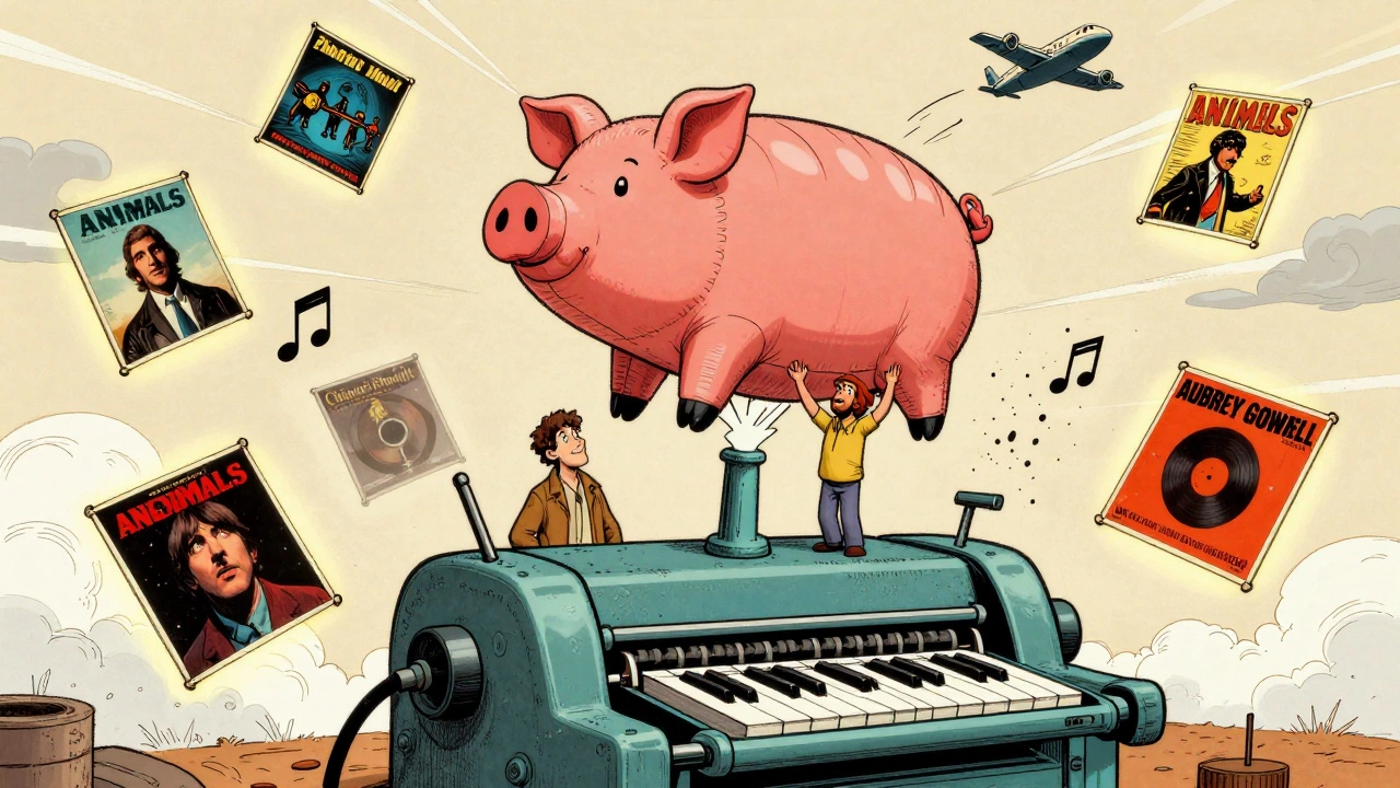
Before the 70s, album art was mostly handled by studio designers. Then came Hipgnosis - Storm Thorgerson and Aubrey Powell - who turned album covers into cinematic experiences. For Pink Floyd’s Animals, they spent three days photographing Battersea Power Station with a 12-foot inflatable pig floating between the chimneys. The pig? It broke loose during the shoot and drifted into Heathrow’s flight path. Air traffic controllers panicked. The band didn’t care. They loved it. That chaos became part of the story.
Then there was Roger Dean. He didn’t just paint album covers - he built entire worlds. For Yes’s Tales from Topographic Oceans, he used 12 custom-mixed acrylic colors. Each layer had to dry before the next was added. One painting took weeks. The result? Floating castles, impossible cliffs, glowing rivers. It wasn’t fantasy. It was a new kind of reality. Dean’s art didn’t illustrate the music - it expanded it. Fans didn’t just listen to Yes. They wandered through Dean’s landscapes in their minds.
Not every cover was expensive. Black Sabbath’s debut had a budget of $60. The photo was taken in a ruined house in Warwickshire with no lights. The grainy, shadowy look? That wasn’t a design choice. It was necessity. And somehow, it made the cover feel even darker, heavier - like the music itself. Sometimes, limitations made the art better.
The Typography That Stung
Words mattered. Not just the song titles - the way they were written. The Wailers’ Burnin’ had lettering that looked like it had been scorched into wood. That wasn’t a font. It was real wood, treated with chemicals, burned with a torch, then photographed. Each letter cost £85 in 1973 - that’s over £750 today. The texture wasn’t decorative. It was political. It screamed resistance. The burned letters weren’t just a style. They were a statement: this music came from fire.
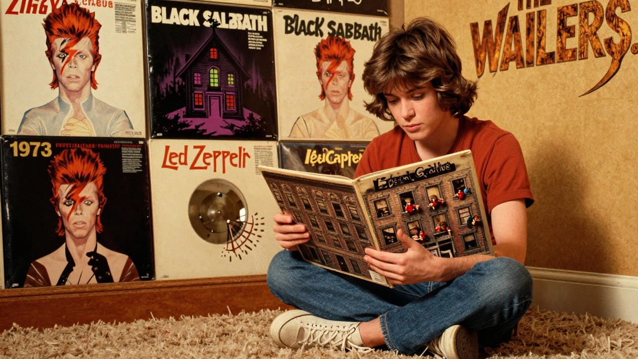
David Bowie’s The Rise and Fall of Ziggy Stardust had a different kind of power. The cover showed Bowie as Ziggy, standing under a street sign that read “K. West.” The sign wasn’t real - it was painted. But the way the light hit his face, the sharpness of the red jacket against the gray wall - it felt like a still from a movie that hadn’t been made yet. That cover didn’t just introduce a character. It made you believe he existed. And when you saw it, you knew you were looking at something new. Something dangerous. Something unforgettable.
Why These Covers Still Matter
Today, most album art is 300x300 pixels. Tiny. Flat. Digital. You scroll past it in seconds. But back then? You sat with it. You turned it over. You read the liner notes. You stared at the cover until you found something new - a hidden symbol, a shadow that looked like a face, a color you hadn’t noticed before.
That’s why these covers still sell for thousands. A sealed 1973 first pressing of The Dark Side of the Moon went for £12,500 in late 2025. The original artwork for Animals was bought by MoMA for an estimated $2.5 million. And it’s not just collectors. On Instagram, #ZiggyStardustArt gets 42,000 new posts every month. Millennials who’ve never touched a vinyl record still know the prism. They use it as their profile picture. They don’t need to know the songs to recognize the image.
Even Beyoncé paid homage in 2022. Her Renaissance cover borrowed the geometric framing and stark lighting of Rod Stewart’s Every Picture Tells A Story - a 1971 cover that took 17 tries to get right. The past isn’t dead. It’s still shaping what we see now.
The Cost of Perfection
These covers weren’t easy. They were expensive. They were risky. They broke rules. The original cover for The Rolling Stones’ Some Girls was pulled after two weeks because the women pictured threatened to sue. The band had to scramble and redo it - losing money, losing time. But they didn’t back down from the idea. They just changed the image.
Color registration was a nightmare. Printers couldn’t always align the cyan, magenta, yellow, and black perfectly. Some early pressings of The Dark Side of the Moon had a slight blue tint where the prism should’ve been pure white. Collectors now hunt for those “mistakes.” They’re not flaws. They’re fingerprints. Proof that this was made by human hands, under pressure, with imperfect tools - and still, it became perfect.
What We Lost
Today’s digital covers are clean. Efficient. Easy to change. But they’re also forgettable. You don’t remember them. You don’t touch them. You don’t argue about them. The 70s gave us art that demanded attention. That asked questions. That made you feel something before you even pressed play.
That’s why these covers still live. Not because they’re old. But because they were made with obsession. With sweat. With fire. With money. With time. With risk. And because of that, they’re not just images. They’re landmarks. On the map of culture. In the minds of people who still believe music is more than a stream. It’s a world. And these covers? They were the doors.
Why are 1970s album covers still so valuable today?
They’re valuable because they’re rare, handcrafted, and culturally significant. Original pressings used expensive printing techniques, limited runs, and physical materials like real zippers or die-cuts that couldn’t be easily replicated. Collectors prize them not just for the music, but as art objects - with provenance, condition, and historical weight. A sealed 1973 pressing of Pink Floyd’s The Dark Side of the Moon sold for £12,500 in 2025, and original artwork from covers like Animals was acquired by MoMA for $2.5 million.
What made 1970s album art different from the 1960s and 1980s?
In the 1960s, covers were often simple band photos or psychedelic patterns. The 1970s shifted to conceptual, narrative-driven art - like Pink Floyd’s prism or Led Zeppelin’s movable windows. By contrast, the 1980s embraced bright, bold, and simplified designs meant for TV and MTV, where covers had to grab attention in seconds. The 70s had time, space, and money to invest in detail. The LP format gave artists room to explore, while the rise of album-oriented rock meant fans wanted to engage deeply - visually and musically.
Who were the key artists behind these iconic covers?
Storm Thorgerson and Aubrey Powell of Hipgnosis designed covers for Pink Floyd, Led Zeppelin, and Genesis. Roger Dean created the fantasy landscapes for Yes and Asia. Andy Warhol designed the zipper for The Rolling Stones’ Sticky Fingers. David Larkham crafted the lettering for Rod Stewart’s Every Picture Tells A Story. Each brought a unique vision - from surreal photography to hand-painted worlds - turning album art into a respected art form.
How did printing technology shape 1970s album art?
Four-color process printing allowed for richer, more accurate colors - critical for covers like Gloria Gaynor’s Park Avenue Sound with its neon trails. Die-cutting enabled interactive elements like Physical Graffiti’s apartment windows. Airbrushing gave Roger Dean’s fantasy scenes depth and glow. But these techniques were finicky. Color misalignment, ink bleeding, and registration errors were common. Some flaws became prized by collectors. The technology didn’t just enable art - it forced creativity within limits.
Why did punk album covers in the late 70s look so different?
Punk rejected the polished, expensive aesthetic of mainstream 70s rock. Bands like The Ruts used cheap collage, hand-cut stencils, and rough typography on their 1979 album The Crack. The cover cost only $300 to make - a direct contrast to the $8,200 average budget for a major label cover by 1979. It wasn’t about beauty. It was about rebellion. The raw, DIY look matched the music’s energy and attitude, proving that impact didn’t require high production - just conviction.


